I Got Purple, I Got Grape

For my latest design project, I’m venturing in to some new, very bright territory.  My client/friend is going through a bit of a life change and wanted to revamp her bedroom with a serious injection of tranquility and COLOR.  The combination of the two has been a bit challenging to say the least.  Per her request, I’ve been doing some serious research on purple rooms.

As I’m still working on the finishing touches of the mood board and overall plan for her room, I thought I’d share some of my inspiration as the color choice can be very tricky to work with.

So for today’s post, I bring you the PURPLE ROOM ROUND-UP!

Crate & Barrel

This was our initial inspiration to kick off the project.  A purple throw quickly turned in to purple walls….

Purple & Teal

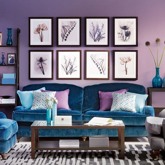
Luckily we’re not taking it quite this extreme, but sometimes you have to go too big and edit, than to play it too safe from the start.

Feminine Purple

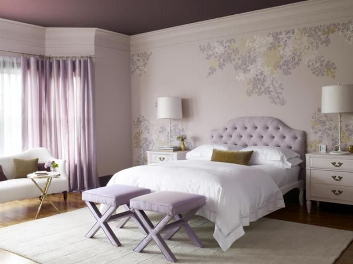
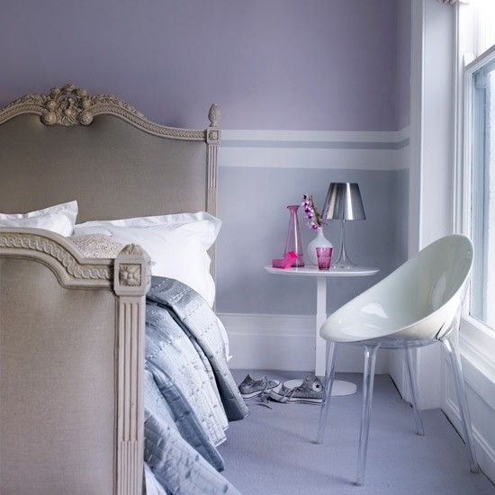
A more feminine, softer take on the color.

Neutral Purple

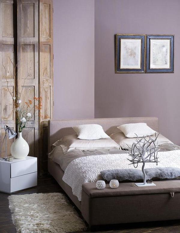
A neutral, more organic feel.

Elle Decor 4

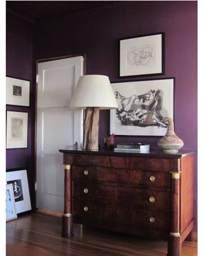
Deep, rich, and a little moody.  Perfect for a bedroom.

House to Home 1

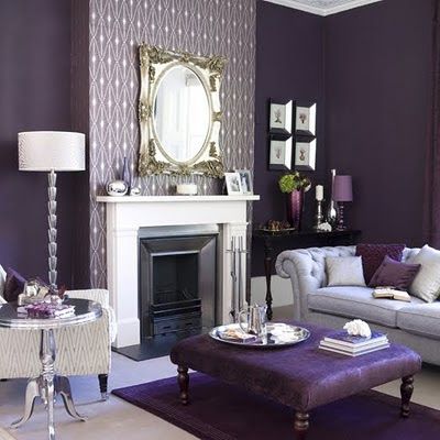
Loving the juxtaposition of feminine colors with the more masculine, modern lines of the paint treatment.

Purple Grasscloth

I just want to pet grasscloth.  I’ve loved it since the first time I saw it in the home of a wealthy friend of my grandmother.  And in such a fun color, you can’t go wrong.  It’s such a hip take on a traditional design tool.

Dark Purple

Bold and girlie.

House to Home 2

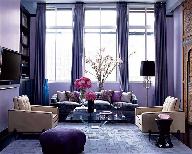
Soft, simple and relaxing.

Elle Decor 1

Upscale meets young and funky.

Elle Decor 2

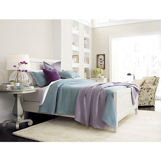
Tranquil and fresh when combined with crisp white cabinetry.

Purple Chaise Room

Probably the closest in feel to where we’ll actually end up…

I’ve found that I’m most drawn to the shades of purple with grey and blue undertones while my friend loves the shades verging on pink and red.  So what do you guys think?  Would you ever paint a room purple?  I can honestly say that I can knock that off my list of design firsts; as a kid, my stepmom painted over the rose stenciling of my childhood bedroom, with a bright purple for my teen years.  I naturally chose a vibrant teal for the trim.  Gotta love those 90’s color palettes…

Advertisement

Emerald

For those that don’t know, the awesome people over at PANTONE select a color every year that is a combination of inspiration from around the world of what’s current and hip with what the group thinks is yet to come in the world of color, art and design.  I haven’t been a huge fan of past years choices, particularly 2011’s (I’m clearly not a pink girl):

tumblr_meski1alUk1r2j7ub

(courtesey of Martin Binder)

This year, however, I was clearly ahead of my time.  Recent purchases of mine predating this year’s announce have included (but are not limited to) the following:

OB-Emerald

Shocker, I present to you Pantone’s 2013 color of the year:

plentyofcolour_emeraldpantone

(courtesy of Plenty of Colour)

Maybe I should give them a call around July and let them know what the color scheme of my recent purchases has been?

Lastly, it’s time for a shameless plug.  For myself.  Interior design has become a serious hobby of mine and I hope to turn it in to quite a bit more in the future.  I know this little blog is still in what I like to call the “trial and error” phase, but I’d love it if all of my 15 readers could share my blog with just one friend.  Or family member. Yes, your mother counts…. unless it’s my Nana – mom, we both know she’s never getting the hang of the computer thing…. Which, if everyone just shares with that one other person, that means I’ll have a whopping 30 people reading my little old thoughts.  That’s like an entire public high school English class!   Or a little league team.  But honestly, why would a little league team be reading… go Dodgers!

Anyways, thanks all for taking the time.  I sincerely want to high five each and every one of you for continually reading my little old site.  Keep at it.  Please.  Because I love writing for you.  Sledge out!