First and foremost – I’d like to send out a little love in to the universe as we’ve reached Sledgehammer with Style’s 1st BLOGIVERSARY! I can’t believe I’ve been putting my random thoughts out in to the interweb universe and a few of you have actually read them and come back for more! Thank you everyone for keeping me inspired to keep writing and decorating!
Speaking of decorating, today’s post is about how decorating can be therapeutic and great for the soul. Who needs a shrink when you’ve got a 25% off coupon for Crate & Barrel?! Such is the case for today’s “client”. My best friend Harriet recently went through a life change when she and her husband amicably went their separate ways. She kept their place in Boston and in an effort to get a fresh start, decided she wanted to revamp her bedroom.
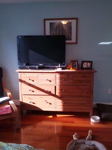
So here’s where we are starting: a gender neutral space populated mostly with post-college Ikea furniture.


So once the big split happened, the first thing I recommended to her is to rearrange her furniture. It was the quickest and easiest way to get a new perspective on things without spending a dime. So while we planned her new room, she literally flipped her perspective 180 degrees. And what a change! It felt like a whole new room.
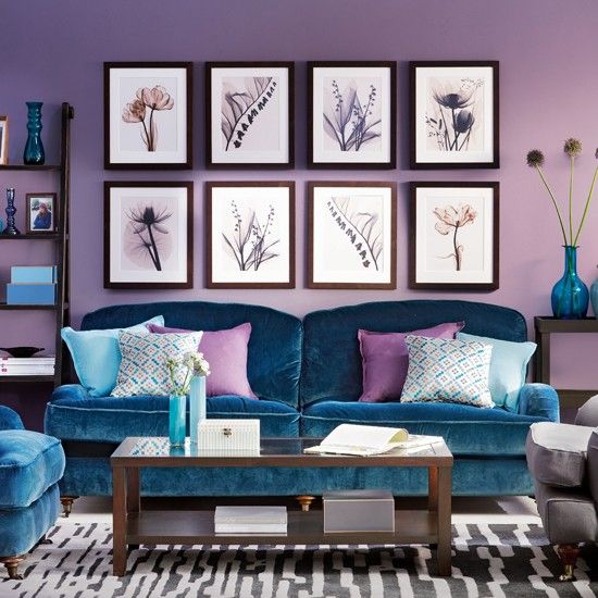
Next up, she decided on her point of inspiration for the design: a peacock feather. It holds some serious sentimental value for us as it was part of our sorority in college, but that doesn’t mean I’m going to let her plaster the room with feathers and dip everything in peacock blue. So we took the elements we liked such as that deep rich blue as a starting point.
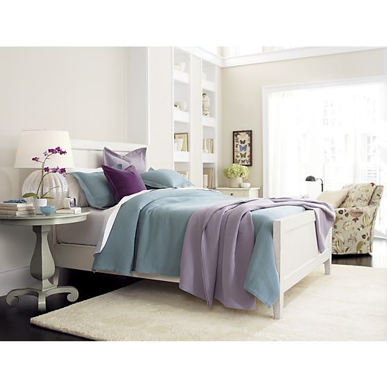
Since it’s such a bold color, we decided that it could be an accent color while we would create a room around it with soft, neutral colors to give her a calming haven to retreat to at night. So here’s my first run at a plan for her room:
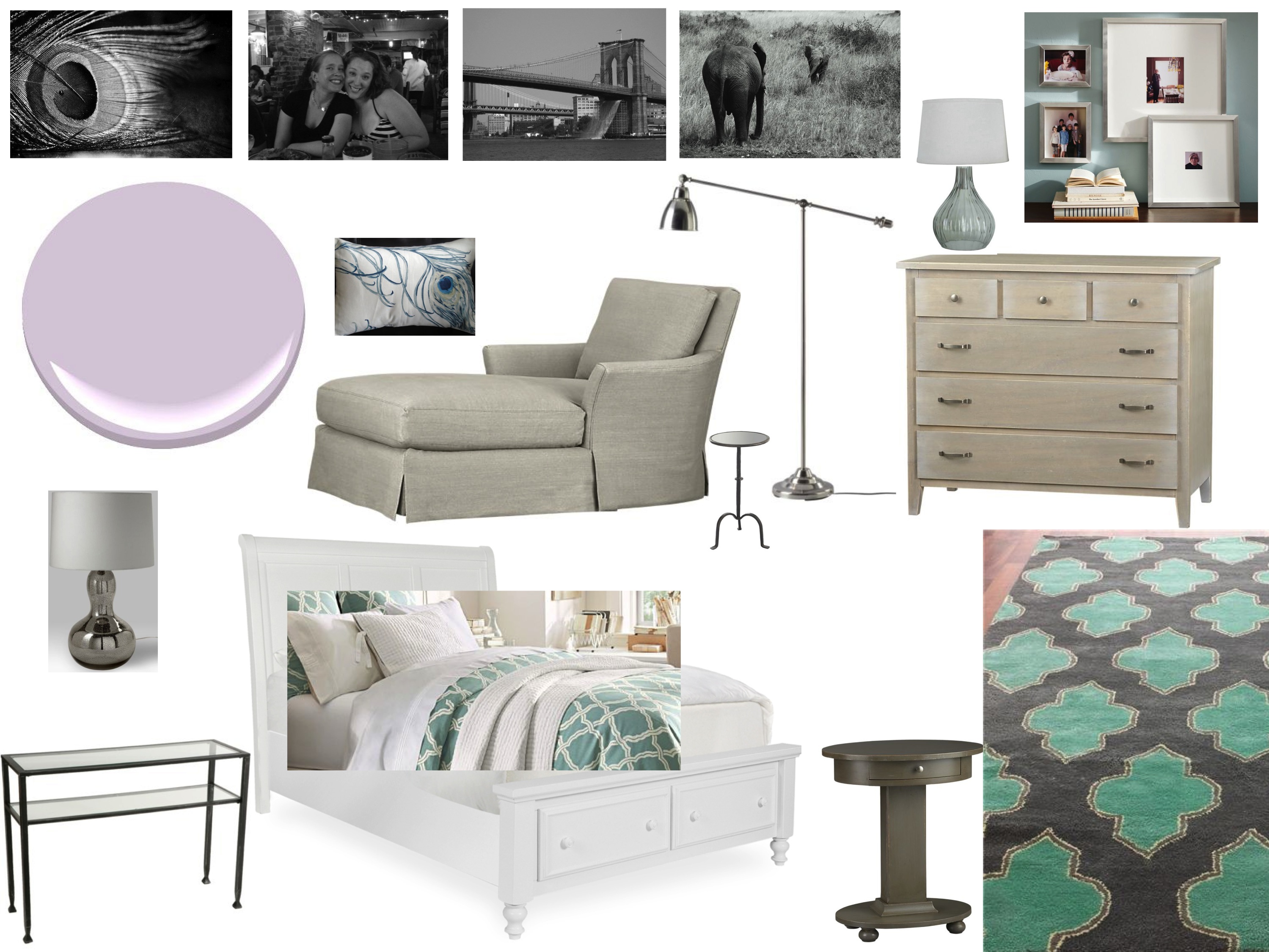
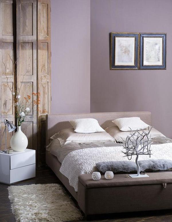
This is also the point when, despite her protests, I convinced her to paint. It’s the quickest, cheapest way to totally transform a space. We decided on a pale purple which would accent the peacock blue/teal accents we had been eyeing. But as all designs go, we didn’t quite agree on which purple that was. She’s a bit more of a girlie girl and leaned more towards a shade with pink undertones. I recommended she pick up some test pots of a few colors and try them out before she paint the whole room in a color we (I) weren’t totally convinced was just right. Here’s the tester:

We both agreed that the one on the left was way too pink. The one on the right is a bit more in line with what we were thinking. So a few weeks later, she bit the bullet, bust out the credit card for some new furniture AND tackled painting the whole room herself with one fabulous finished product (I apologize for the photos as we haven’t had a chance to do some serious “after” photos yet):


Now we had some serious momentum to keep rolling. The dresser is the Sorano 6-Drawer Dresser from Crate & Barrel. It reminds me of driftwood; I’m totally in love with it. Harriet and I went through a LOT of rug choices. She was particularly found of this Sonnet Area Rug in turquoise from Home Decorators Collection:

But ultimately, she decided on the Jasper Area Rug in aqua from Crate & Barrel. And to round out her shopping cart, she chose this amazingly comfortable Haven Chaise which she had fallen in love with during a window shopping trip in LA with yours truly.
Then after a long search for non-white bedding that wouldn’t show dog fur (she has an adorable long-haired dachshund named Snickers), Harriet picked some great bedding from West Elm: the Braided Matelasse Duvet Cover.

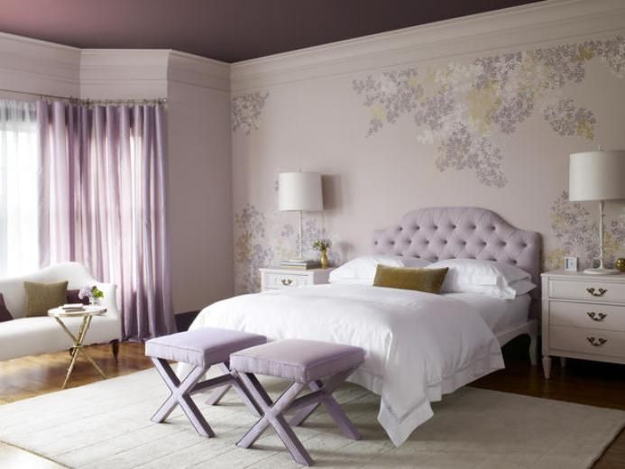
So after some tweaking thanks to a new paint color and some new design decisions, here’s the updated mood board for the space:

Then thanks to the Red Sox fabulous season and a spot in the playoffs, Jefe and I took off for Boston for a baseball game and some much needed time with my bestie. Unfortunately for her, the West Elm duvet was out of stock online. I, however, live around the corner from the store…. so my carry-on ended up filled to the brim with bedding instead of clothes.
While we were enroute, Harriet had a great bed frame delivered. It’s got storage for those bulky sweaters needed to bear the Boston winters. It’s from a local retailer, Jordan’s.
Once we landed in Boston, Jefe had to take a work call so Harriet and I took a quick jaunt to Home Goods where we made an INCREDIBLE score. We found a pair of AMAZING lamps that matched her new rug exactly. And they were the perfect way to bring some of the pale, minty teal over to the other side of her room on her future beside tables. Check out one of these gorgeous, curvy ladies (note that we ensured that we could fix the crooked shade before she purchased):

What an amazing score. Under $100 for BOTH of them. We were stoked. And Jefe gave us quite the look when we both walked in the front door, arm in arm with our lamps. We looked like little girls with their arms caught in the cookie jar.
So now our search has turned to sheets, nightstands and a side table for her chaise and some artwork. We both love the idea of black and white photos throughout the whole room; we just have to find the right ones.
And while we were there, we discussed a few other areas of her place we’d love to tackle down the road. I love a good project so there will definitely be more to come!