Oh Baby… Nursery

Babies, babies everywhere.  I can’t count on one hand the number of little bundles of joy that are about to arrive on the doorsteps of friends and family in the next few months.  This happens to include my stepsister who welcomed my adorable first nephew on Sunday!

My best friend also happens to be due in the next week so she recently asked me for some nursery inspiration while she prepped for the arrival of her little girl.  So today I’m sharing some of my favorite finds for all styles of nurseries from neutral and glamorous to gender specific and rustic.

Classic Nursery

via

Let’s start with this classic beauty.  Neutral colors with a slightly playful theme thanks to the zebra and hot air balloon and a classic crib.

Grey Modern Glam Nursery

via

Contemporary, abstract art over a crib – so glamorous.  And the contrast of colors against the moody grey walls – perfection.  The patterned rug just kicks it up a notch.  This particular nursery is clearly doing double duty too for when those giddy grandparents come to visit.

Neutral Modern Glam Nursery

via

How luxurious does this nursery feel?  It’s gender neutral and could so easily be achieved with a little blood, sweat and DIY.  All you need is quite a bit of cheap off-white fabric, a staple gun, some painters tape and a gallon of paint.  Top it off with a glamorous light fixture and you’re in business.

Rustic Nursery

via

So I cheated a bit and this is an old ad from Restoration Hardware’s Baby & Kids line.  But I’m completely in love with the rustic charm and the perfect way they styled a nursery that’s a little girlie without looking like a pink crayon vomitted everywhere.

Vintage Pale Blue Nursery

via

Vintage charm is all over this room.  I love that the desaturated blue of the walls is a few shades off the traditional baby blue of most nurseries.  And the bunting combined with a it of chevron on those curtains brings it in to the 21st century.

Traditional Vintage Nursery

via

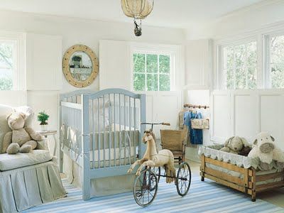
If you’re looking for more of a traditional space, this is the room for you.  I die over the antique-looking toys and that mirror over the crib is so elegant.

Super Glam Nursery

via

This gem has been making the blog rounds for quite some time, but I completely see why – you want glamour for your little girl, this is the room for her.  Shiny surfaces and animal print?  CHECK!

Grey and Purple French Nursery

via

Or maybe she is more into shabby chic, French country charm?  Done!

Peach Grey Champagne Nursery

via

Or you think she’ll be a little eclectic, but with a sweet side?  A room filled with peach, champagne and gold is the place for her.

Eclectic Boys Nursery

via

Perhaps it is a little boy who needs a little eclectic space of his own?  Combine an industrial fixture with a vintage map and some burlap curtains, and you’re good to go.

Navy Glam Nursery

via

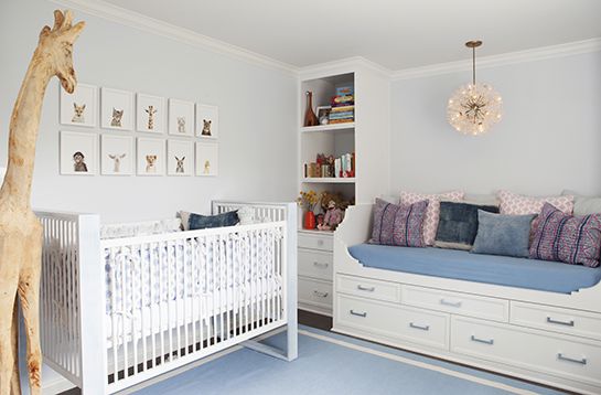
White and navy with a touch of silver is perfection.  All the pieces (minus the crib) could be repurposed as the child grows or seamlessly moved in to other rooms of the house.

The Animal Print Shop by Sharon Montrose

via

Minimalist, white and clean.  But the light wood, adorable artwork and the sheepskin rug warm up the space for a little bundle of joy.

The Animal Print Shop by Sharon Montrose.

via

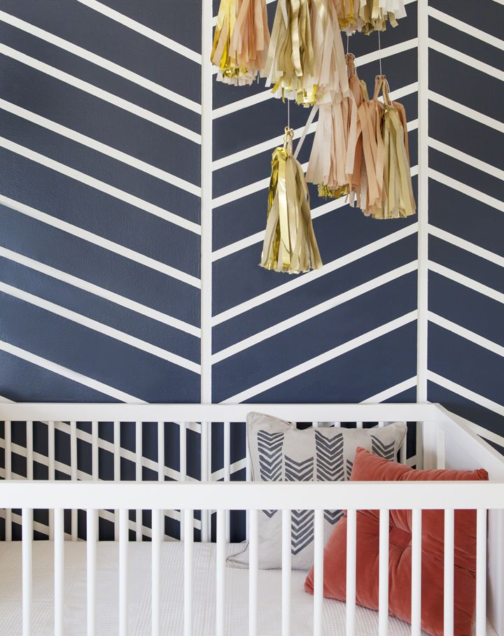
Then their are those new moms who just know their little one will be fashionable and always on trend.  Then herringbone and tassel garlands are just for them (and it serves as a stylish alternative to a mobile).

Navy and Red Modern Nursery

via

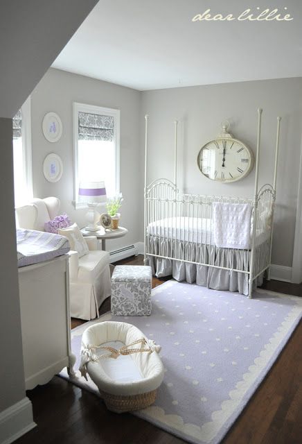
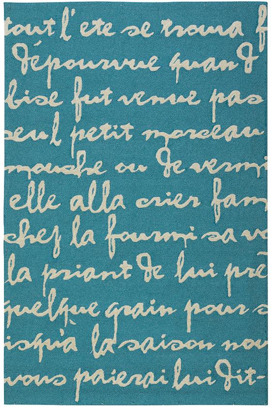
I think we’ve seen some variation of that rug a few times… looks like it’s a clear winner in nursery land.  When paired with striped crib bedding and crisp roman shades, the room suddenly has a preppy feel.

Grey and Pink Glam Nursery

via

Maybe you just want to embrace your little girl’s feminine side?  Swatches of pink, monogrammed wall art and a chandelier are just for her.

Neutral Glam Combo Nursery Guest Bed

via

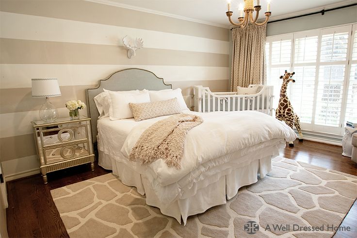
If you’re raising a little gentleman or lady, this elegant nursery/guest room combo is the perfect space.

Modern Glam Nursery

via

Modern.  Pink.  Perfection.  And I don’t even like pink.

Pink and Gold Princess Nursery

via

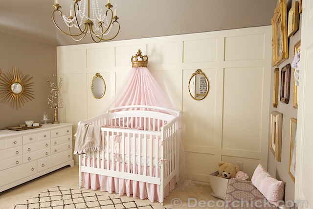
If she really is a princess, this space is for her.

Modern Boy Nursery

via

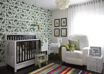
I die over that kelly green wall paper.  Baby would love staring at it!

Modern Graphic Nursery

via

Modern and graphic.  With a hint of mid-century modern thrown in.

And now for a little extra dose of awesome: a few celebrity nurseries to drool over:

Bill and Giuliana Rancic Nursery

via

Bill & Giuliana’s house is perfection.  I expect nothing less for their little guy’s space.  I want that grasscloth wallpaper.  Now.

Jenna Lyons Nursery

via

This nursery belongs to momma/queen of style Jenna Lyons.

The Animal Print Shop

via

I’m loving the clean lines and soothing colors of this beauty, the home of Molly Sims’ babe.

So what do you think – I see some serious themes popping up lately in nursery styles – print rugs and giant giraffes are clearly all the rage.  I also love the practicality of most of the spaces – all of them seem to be able to easily transition as the child grows older.  And not a licensed character in sight!  Not that I have anything against Mickey or Buzz Lightyear… I’d just prefer a little more subtle use of whimsy 😉

Say It Ain’t So! Goodbye Expedit

Unless you’re an avid record collector (who for now are the most irate), you may not have heard the news.  Ikea may be discontinuing the EXPEDIT line (rumored here, here and here).  The whole thing.  For the time being, it’s said to only be relegated to Germany, but most things I’ve read speculate that it’s only a matter of time before it hits the rest of the world.  A petition on Facebook to save the favored shelving has already reached over 15K likes.

They are replacing it with another, similar style but I feel like this is an end of an era and possibly a huge misstep on Ikea’s part.  I don’t think they realize how widespread the use of that line really is – I’ve seen it used everywhere from a starter dorm room to high-end, luxury celebrity homes.

What are we going to do without this serious work horse piece of furniture?  I scoured and found the below image of it’s supposed replacement, the ‘Kallax’.  What do you think?

Ikea Kallax

I’m not a huge fan and think it’s too similar to other styles.  The Expedit had that thick frame – very Parsons-like that so many people adored.

There have been many blogger odes to this marvelous wonder, but today is sadly more of an obituary.  So in honor of its final days, I’ve rounded up some of my favorite uses for the EXPEDIT.  Enjoy.

BHG - Stacked Expedit

&

BHG - Stacked Expedit 2

via

Loving the stacked look from designer Meg Lonergan.  And the mirror hanging in front makes it look oh-so-chic and gives it a built-in quality.

Apt Therapy - Mega Expedit Wall

via

This entire wall was created with a combination of different Expedits.  It’s a bibliophile’s work of art.

Apt Therapy - Office Expedit Parson Style

via

I’ved loved this photo for as long as I can remember.  It pairs with a Parsons desk perfectly and the lack of a backing lets the dark and moody paint color shine through.

Live Creating Yourself - Expedit Turned Bar

via

Everything Everygirl is perfection to me.  Alaina Kaczmarski styled this piece for her dining room – display storage for her beautiful plates and glassware with an added place to include a bar.

BHG - Expedit Display Shelving

via

An Expedit is a great way to display a collection.

BHG - Expedit Room Divider

via

A perfect example of two of the most-used reasons for the Expedit – room divider and color-coordinated bookshelf.

Elle Decor - High End Expedit

via

Elle Decor showcases how an Expedit fits in seamlessly when paired with more high-end furnishings in the home of Jayson Home’s Devin Kirk.

Adore Mag - Expedit Closet Style

via

Have too much closet space (is that an actual problem?!) without enough shelving?  Display those heels and handbags like the works of art they truly are.

I have had my Expedit since I moved to Los Angeles 6+ years ago (I can’t believe it’s been that long!) and don’t plan to get rid of it any time soon.  It’s a storage monster and an absolute necessity in our home.  So who would like to raise a glass and toast the amazing, incredible Expedit with me?!

*Update:  The Huffington Post has confirmed with an Ikea spokesperson that this is true.  It’s a sad, sad day.

Decorating for the Soul

First and foremost – I’d like to send out a little love in to the universe as we’ve reached Sledgehammer with Style’s 1st BLOGIVERSARY!  I can’t believe I’ve been putting my random thoughts out in to the interweb universe and a few of you have actually read them and come back for more!  Thank you everyone for keeping me inspired to keep writing and decorating!

Speaking of decorating, today’s post is about how decorating can be therapeutic and great for the soul.  Who needs a shrink when you’ve got a 25% off coupon for Crate & Barrel?!  Such is the case for today’s “client”.  My best friend Harriet recently went through a life change when she and her husband amicably went their separate ways.  She kept their place in Boston and in an effort to get a fresh start, decided she wanted to revamp her bedroom.

So here’s where we are starting: a gender neutral space populated mostly with post-college Ikea furniture.

Before 5

Before 1

Before 2

Before 3

Before 4

So once the big split happened, the first thing I recommended to her is to rearrange her furniture.  It was the quickest and easiest way to get a new perspective on things without spending a dime.  So while we planned her new room, she literally flipped her perspective 180 degrees.  And what a change!  It felt like a whole new room.

Next up, she decided on her point of inspiration for the design: a peacock feather.  It holds some serious sentimental value for us as it was part of our sorority in college, but that doesn’t mean I’m going to let her plaster the room with feathers and dip everything in peacock blue.  So we took the elements we liked such as that deep rich blue as a starting point.

Since it’s such a bold color, we decided that it could be an accent color while we would create a room around it with soft, neutral colors to give her a calming haven to retreat to at night.  So here’s my first run at a plan for her room:

Slide1

This is also the point when, despite her protests, I convinced her to paint.  It’s the quickest, cheapest way to totally transform a space.  We decided on a pale purple which would accent the peacock blue/teal accents we had been eyeing.  But as all designs go, we didn’t quite agree on which purple that was.  She’s a bit more of a girlie girl and leaned more towards a shade with pink undertones.  I recommended she pick up some test pots of a few colors and try them out before she paint the whole room in a color we (I) weren’t totally convinced was just right.  Here’s the tester:

IMG_20130915_133019

We both agreed that the one on the left was way too pink.  The one on the right is a bit more in line with what we were thinking.  So a few weeks later, she bit the bullet, bust out the credit card for some new furniture AND tackled painting the whole room herself with one fabulous finished product (I apologize for the photos as we haven’t had a chance to do some serious “after” photos yet):

IMG_20131001_084310

IMG_20131001_084323

Now we had some serious momentum to keep rolling.  The dresser is the Sorano 6-Drawer Dresser from Crate & Barrel.  It reminds me of driftwood; I’m totally in love with it.  Harriet and I went through a LOT of rug choices.  She was particularly found of this Sonnet Area Rug in turquoise from Home Decorators Collection:

Sonnet Rug

But ultimately, she decided on the Jasper Area Rug in aqua from Crate & Barrel.  And to round out her shopping cart, she chose this amazingly comfortable Haven Chaise which she had fallen in love with during a window shopping trip in LA with yours truly.

Then after a long search for non-white bedding that wouldn’t show dog fur (she has an adorable long-haired dachshund named Snickers), Harriet picked some great bedding from West Elm: the Braided Matelasse Duvet Cover.

West Elm Bedding

So after some tweaking thanks to a new paint color and some new design decisions, here’s the updated mood board for the space:

Slide1

Then thanks to the Red Sox fabulous season and a spot in the playoffs, Jefe and I took off for Boston for a baseball game and some much needed time with my bestie.  Unfortunately for her, the West Elm duvet was out of stock online.  I, however, live around the corner from the store…. so my carry-on ended up filled to the brim with bedding instead of clothes.

While we were enroute, Harriet had a great bed frame delivered.  It’s got storage for those bulky sweaters needed to bear the Boston winters.  It’s from a local retailer, Jordan’s.

Once we landed in Boston, Jefe had to take a work call so Harriet and I took a quick jaunt to Home Goods where we made an INCREDIBLE score.  We found a pair of AMAZING lamps that matched her new rug exactly.  And they were the perfect way to bring some of the pale, minty teal over to the other side of her room on her future beside tables.  Check out one of these gorgeous, curvy ladies (note that we ensured that we could fix the crooked shade before she purchased):

IMG_3616

What an amazing score.  Under $100 for BOTH of them.  We were stoked.  And Jefe gave us quite the look when we both walked in the front door, arm in arm with our lamps.  We looked like little girls with their arms caught in the cookie jar.

So now our search has turned to sheets, nightstands and a side table for her chaise and some artwork.  We both love the idea of black and white photos throughout the whole room; we just have to find the right ones.

And while we were there, we discussed a few other areas of her place we’d love to tackle down the road.  I love a good project so there will definitely be more to come!

Crate & Barrel Meets Mallorca

One of my old bosses used to call me Mallorca.  I’m a fan of nicknames: Sledge, Champ, and Red just to name a few, but I was kind of indifferent towards this one.  That all changed this week when I was introduced to Paola Navone’s stellar collection for Crate & Barrel, which just so happens to be inspired by this very island.  Yes, geography was admittedly not my strong suit in school and no, I had never done my homework on this GORGEOUS island until now.  Thanks to my quick Googling I’ve come to realize that I should have taken the nickname as a serious compliment; Mallorca is absolutely stunning and has earned itself a stellar position on my list of places I have to visit some day.

Conde Nast Mallorca

via

Conde Nast Mallorca 2

via

But back to Paola.  She’s a world-renowned architect, decorator, artist and world traveler who was inspired by Mallorca, along with Como and the French Riviera for this casual yet chic collection of dinnerware, table linens, decoration and furniture.  Starting with her Como Dinner Plates, the deep cobalt blues and organic designs really exemplify what this collection is all about.  Their only purpose in life is clearly to be used for a fabulous al fresco dining over bottles of excellent wine.

Como Dinner Plates

And what is a great dinner party without some hors d’oeuvre?  What better way to show off these little bites than in the Como Spoon Bowls?

Como Spoon Bowls

But I’m getting ahead of myself.  Let’s begin with setting the table.  As a base, I’d start with the Como Gauze Linen Tablecloth.  It’s light and airy while packing a serious punch of color.

Como Gauze Linen Tablecloth

Then I’d pull a few of these Como White Woven Chairs up for my guests.

Como White Woven Chair

For a little ambience and an accent of red, I’d layer on the Como Loopy Candleholders.

Como Loopy Candleholders

We already discussed using these great plates and I’d top them with a set of the Mallorca Linen Napkins.  They have a range of colors, but I’d probably stick with the cobalt blue to keep the look seamless.

Mallorca Linen Napkins

For serving, I’d lay out a full spread with the Mallorca Oval Platters.  They’re so classy and simple and really could be integrated in to a variety decor styles.

Mallorca Oval Platters

And I adore the look of the Riviera Long Serving Set.  The pattern set within the silver reminds me of calm waves splashing on the beach.

Riviera Long Serving Set

My imaginary dinner party is looking pretty good.  Now I just need a great patio with an ocean view….

Mallorca Patio

via

Fabulous Mediterranean al fresco dining isn’t the only thing Paola’s collection has going for it.  I’m totally enamored with this Como Bench.  It could be an incredible accent for a living room in need of a neutral piece of seating or pulled up to a long dining table.  It would serve as a stylish place to put on your shoes in a front entryway.

Como Bench

And personally, I’ve had my eye on this Mallorca Saucer to use as a small tray on top of my dresser to collect perfume bottles.  I think it will be the perfect companion to my West Elm Large White Lacquer Jewelry Box.

Mallorca Saucer

Overall, I think it’s a great collaboration for Crate & Barrel.  Paola Navone is on fire right now; she just did a VERY colorful 20-piece collection for Anthropologie this past spring.

paola navone anthro

via

paola navone anthro 2

via

So what are all of you lusting after from Paola’s collection?  I really would take the whole thing given the opportunity.  It’s 110% my style.