Say It Ain’t So! Goodbye Expedit

Unless you’re an avid record collector (who for now are the most irate), you may not have heard the news.  Ikea may be discontinuing the EXPEDIT line (rumored here, here and here).  The whole thing.  For the time being, it’s said to only be relegated to Germany, but most things I’ve read speculate that it’s only a matter of time before it hits the rest of the world.  A petition on Facebook to save the favored shelving has already reached over 15K likes.

They are replacing it with another, similar style but I feel like this is an end of an era and possibly a huge misstep on Ikea’s part.  I don’t think they realize how widespread the use of that line really is – I’ve seen it used everywhere from a starter dorm room to high-end, luxury celebrity homes.

What are we going to do without this serious work horse piece of furniture?  I scoured and found the below image of it’s supposed replacement, the ‘Kallax’.  What do you think?

Ikea Kallax

I’m not a huge fan and think it’s too similar to other styles.  The Expedit had that thick frame – very Parsons-like that so many people adored.

There have been many blogger odes to this marvelous wonder, but today is sadly more of an obituary.  So in honor of its final days, I’ve rounded up some of my favorite uses for the EXPEDIT.  Enjoy.

BHG - Stacked Expedit

&

BHG - Stacked Expedit 2

via

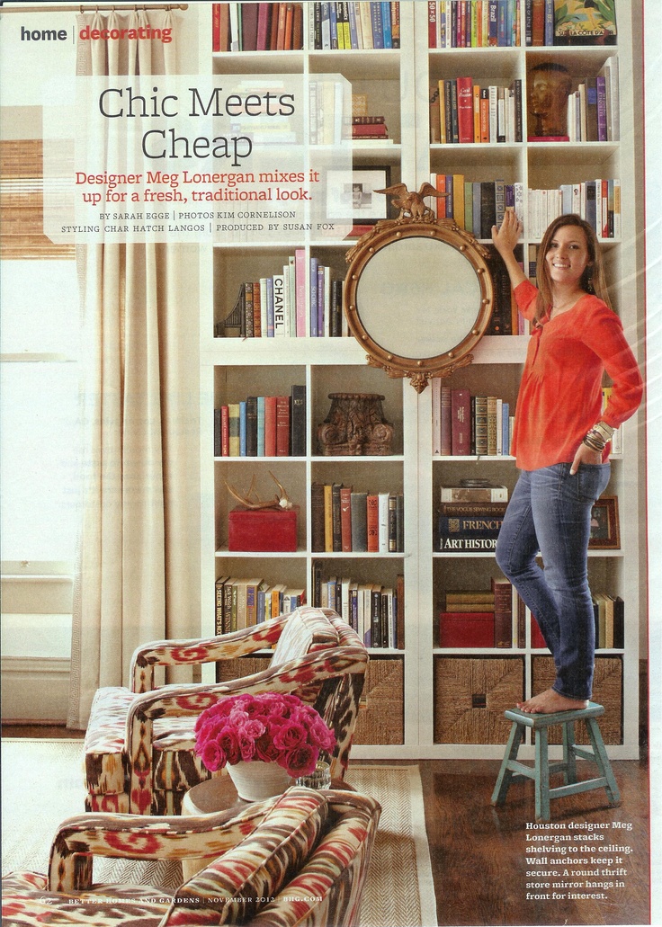
Loving the stacked look from designer Meg Lonergan.  And the mirror hanging in front makes it look oh-so-chic and gives it a built-in quality.

Apt Therapy - Mega Expedit Wall

via

This entire wall was created with a combination of different Expedits.  It’s a bibliophile’s work of art.

Apt Therapy - Office Expedit Parson Style

via

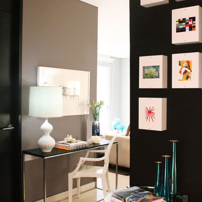
I’ved loved this photo for as long as I can remember.  It pairs with a Parsons desk perfectly and the lack of a backing lets the dark and moody paint color shine through.

Live Creating Yourself - Expedit Turned Bar

via

Everything Everygirl is perfection to me.  Alaina Kaczmarski styled this piece for her dining room – display storage for her beautiful plates and glassware with an added place to include a bar.

BHG - Expedit Display Shelving

via

An Expedit is a great way to display a collection.

BHG - Expedit Room Divider

via

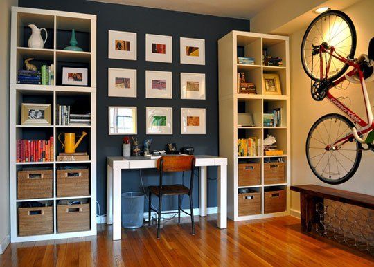
A perfect example of two of the most-used reasons for the Expedit – room divider and color-coordinated bookshelf.

Elle Decor - High End Expedit

via

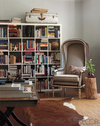
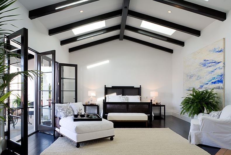
Elle Decor showcases how an Expedit fits in seamlessly when paired with more high-end furnishings in the home of Jayson Home’s Devin Kirk.

Adore Mag - Expedit Closet Style

via

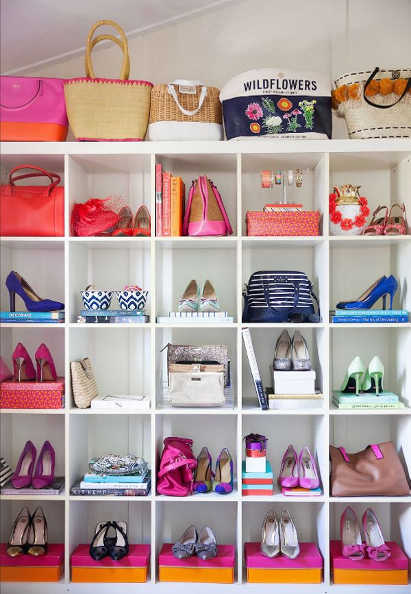
Have too much closet space (is that an actual problem?!) without enough shelving?  Display those heels and handbags like the works of art they truly are.

I have had my Expedit since I moved to Los Angeles 6+ years ago (I can’t believe it’s been that long!) and don’t plan to get rid of it any time soon.  It’s a storage monster and an absolute necessity in our home.  So who would like to raise a glass and toast the amazing, incredible Expedit with me?!

*Update:  The Huffington Post has confirmed with an Ikea spokesperson that this is true.  It’s a sad, sad day.

Advertisement

Q & A: Anne’s PreWar Starter

Hey Mal,

What I’d love your help with is some ideas for how I can break up the institutional whiteness of the walls and the monotony of the furniture to complete the look we have going.

As you can tell, I’m into contemporary design (fine, IKEA and CB2), but have been trying to mesh that with some classic/shabby chic elements – probably just the piano bench, really, but I’m mentally trying! It’s a pre-war apartment (1926) with hard wood floors and some pretty nice molding features, so incorporating some vintage or classical elements would probably bring the room together.

Specifically, the boyfriend and I have talked about getting some bold, cool pieces for the top of the wall unit, painting an accent wall, a new lighting fixture, throw pillows, maybe some additional window treatments. . .just as some starting points. We’ve thought about a rug for the area by the couch, but I think I’d rather not do one.

Look to the painting, which is by an artist from Austin, Texas, the Pittsburgh and Cincinnati bridge photos, and the piano bench, which is from an artisan we met locally (The Divine Chair) for the color palette.

Let me know if you have questions or need anything else. Thanks so much!

Anne

iPhone Pics 061

iPhone Pics 062

iPhone Pics 012

iPhone Pics 060

iPhone Pics 013

iPhone Pics 063

(These are now hanging above her piano)

First off, I would suggest Anne starts in the living room area. She needs some more colors to brighten up the space. Although she’s hesitant, I would seriously consider an area rug. You can bring in color, pattern and texture through one single piece. And with gorgeous yet budget friendly options from places like World Market, Overstock.com, CB2 and One Kings Lane, she could easily find one that fits the space and her budget.  I would go with something like the Confetti Rug from CB2:

CB2 Confetti RugNow, let’s bust out the paint cans.  Anne mentions painting an accent wall, which could be great.  If that’s the direction she wants to go, I would suggest the small wall by the dining area so it doesn’t compete and helps delineate that area as separate from the rest of the living space.  I would also suggest moving the painting to that wall – the white canvas against a colored backdrop will really make the art pop.  Here’s an example of different, primarily white pieces of art against darker walls:

b4d1c59a0f95cbb3_8370-w406-h406-b0-p0--modern-home-office

(Courtesy of Houzz)

Alternatively, you could paint the ceiling beams to really highlight the architecture.  You could even include the little lip of the wall that juts out and meets the ceiling.  Below’s a prime example of how you can give white walls a lot of visual interest with just a little bit of dark paint on ceiling beams:

Spanish-Revival-House-12-1-Kind-Design

(Courtesy of Onekindesign – I’m totally obsessed with the rest of this house tour too!)

Now let’s talk about the windows.  Although Anne gets some great light from the windows at the end of the room, it’s still not a huge amount.  So the first thing I’d keep in mind when hunting for new curtains is to avoid blocking light in any way.  Next suggestion is to rehang the curtain rod high & wide – it’s a common used technique by most designers to make both your ceilings seem taller and your windows seem wider.  This way, the curtain hangs in front of wall when they’re pulled the whole way open and not blocking ANY of the window.  As for a fabric, I probably wouldn’t go white.  I’d pick something with color that corresponds with that rug I’ve convinced Anne to buy like West Elm’s Linen Cotton Grommet Drapes in Desert Marigold to really brighten it up and add texture:

West Elm Marigold Linen Curtains

Anne also mentioned a new light fixture.  The easiest DIY in a rental for one of those infamous boob lights is to hide it with a shade.  Jefe and I did this in our last place (so unfortunately it was pre-blog = no photo), but I based it off of John and Sherry’s tutorial over on Young House Love.  I’d go with a shade that has some color so it does not blend in to the ceiling but I would avoid a pattern as it would directly compete with the piano bench below.  I think a fabric drum shade with a great texture is the right way to go, such as this one from Lamps Plus:

Drum Shade - Grey Burlap

Now let’s talk accessories.  First thing I would do is to add a plant on the window sill.  The green leaves will add another element of color and I always like to have a plant or two in a space to give it some true life.  And as orchids hold a special place in Anne and my’s heart (thank you college sorority), I thought a nice white one with a graphite base could be just the thing that window sill needs:

Potted Orchid

To finish up, I would add some color that coordinates with the rug and curtains through the accessories. I’d suggest some simple pillows from Crate & Barrel

hayward-green-18-pillow tilly-24x16-pillow

…and add some baskets to the lower shelves of the Expedit tv unit.  Then on the upper shelves, I would mix a combination of picture frames , small vases, decorative bowls, books, and other accessories.  A great example of a perfectly styled Ikea Expedit (although without a tv) is below:

1_Ikea-Expedit-Bookcase-Styling

( Courtesy of Meredith & Gwenyth, The New Yorkie)

Lastly,  she already has a great start on the walls with that painting and the gallery wall above the piano.  My one suggestion here is to actually rehang  the gallery wall so the space between the frames is just a bit tighter.  It really helps to make it cohesive.  Below are some great examples, all with black but very different frames:

Dumican Mosey Architects Gallery Wall

(Dumican Mosey Architects)

Lettered+Cottage+Guest+Bedroom+Photo+Wall

(The Lettered Cottage)

So Anne, there you have it.  Your room revamp courtesy of the Sledge.  Please keep us posted on your progress and share an after photo!

Slide1