Isn’t It Revealing?

Yesterday after a great brunch with Jefe’s family, we FINALLY tackled some finishing touches to his parents’ place that were long overdue.

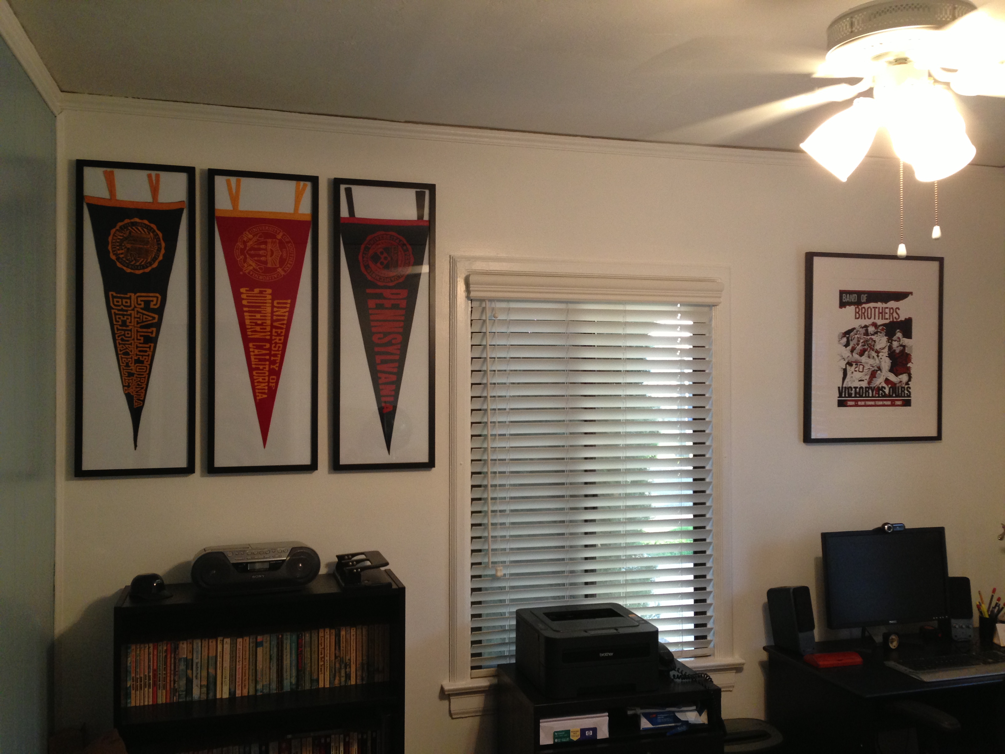
First we started in the office.  A few frames from Aaron Brothers and 3 college pennants later, and we’ve got a wall of artwork.  We choose a few long, skinny frames that were meant for 3 photos.  We ditched the precut mat, attached the pennants to the white backing with a little painters tape, and closed them up.  These 3 pre-made frames cost us a LOT less than the custom ones and they seemed to work just fine.  The pennants happen to represent the alma maters of Jefe, his father, and his brother so it makes it all the more meaningful.  What do you think?!  (Please excuse the bad lighting as I wasn’t planning to blog about this quite yet, but couldn’t hold in the incredible results….)

photo

Next we moved to the right, in the area above the desk.  Luckily, Jefe’s dad already had some great, classy artwork already framed that we popped up there.  It’s a print commemorating when the Red Sox won the World Series in 2004.    Just around the corner to the right, Jefe found this stellar metal sign – an old ad with Ted Williams.  It’s got great coloring, has vintage style and is sports-themed (Have I mentioned this is a die-hard Red Sox family?!)

Last week we relocated a plant from their dining room to really it give it an old-school library feel.  And that sucker has THRIVED.  It’s grown at least 6 inches in the last week, thanks to the direct sunlight.

And without further ado, the big picture, literally:

image

We haven’t tackled the artwork on the accent wall yet as we’re waiting to get a large poster custom framed.  Once that’s up, we’ll finish it off with Jefe’s dad’s diploma and a small gallery wall of Sox themed artwork above the globe.

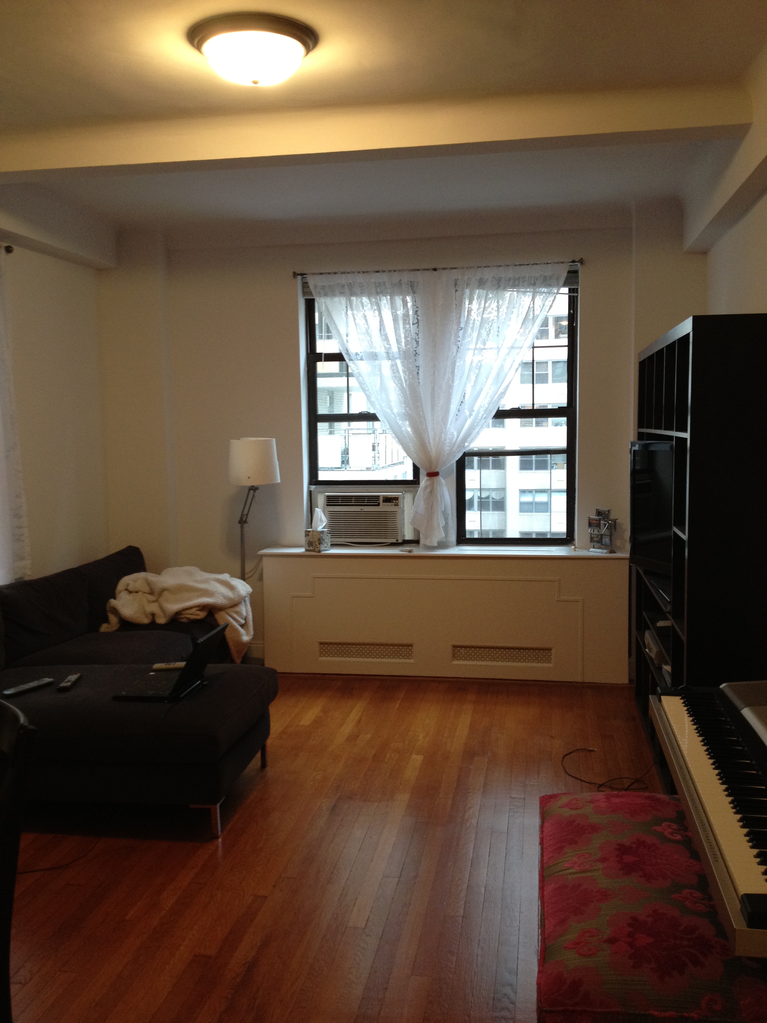
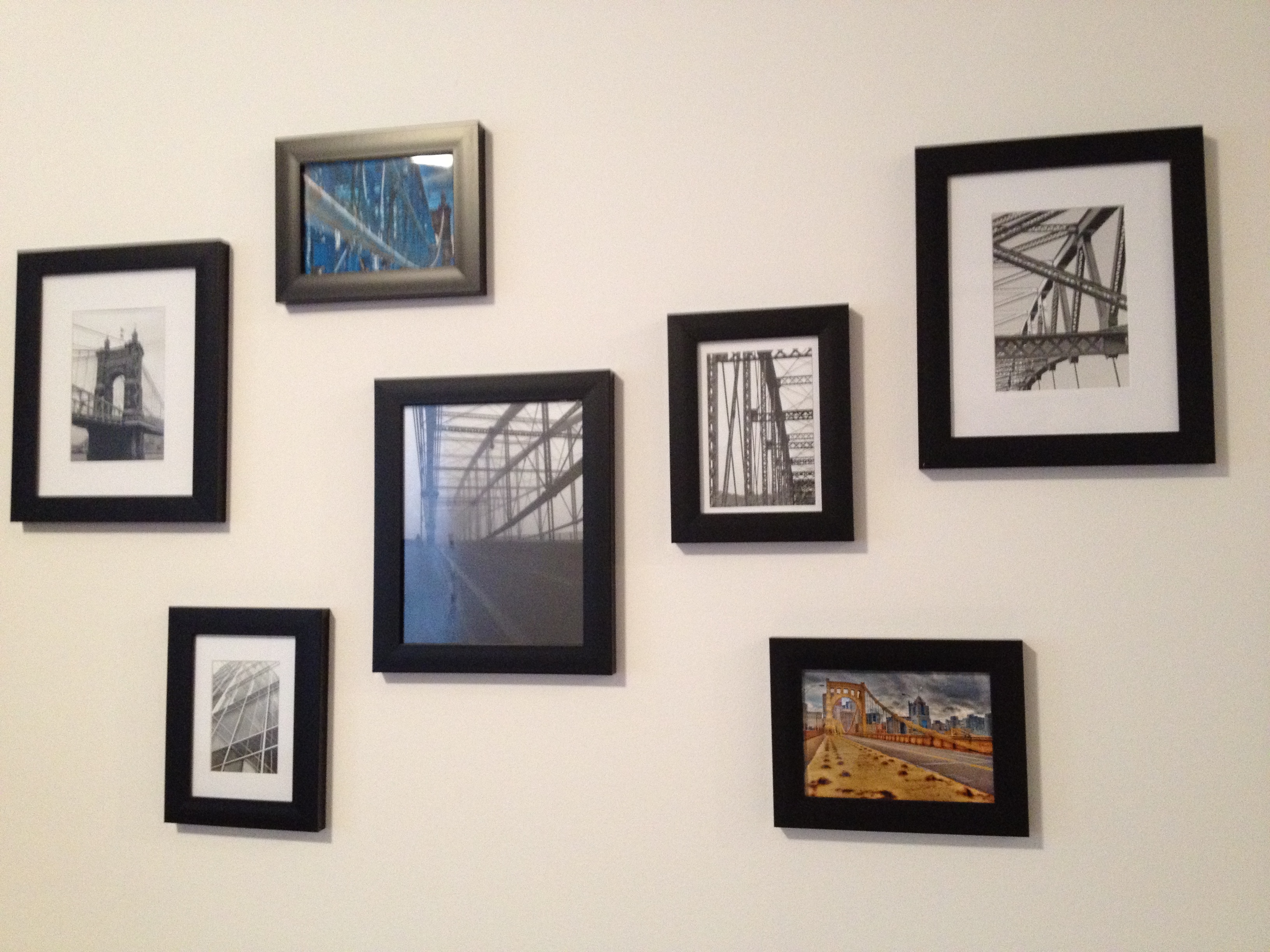
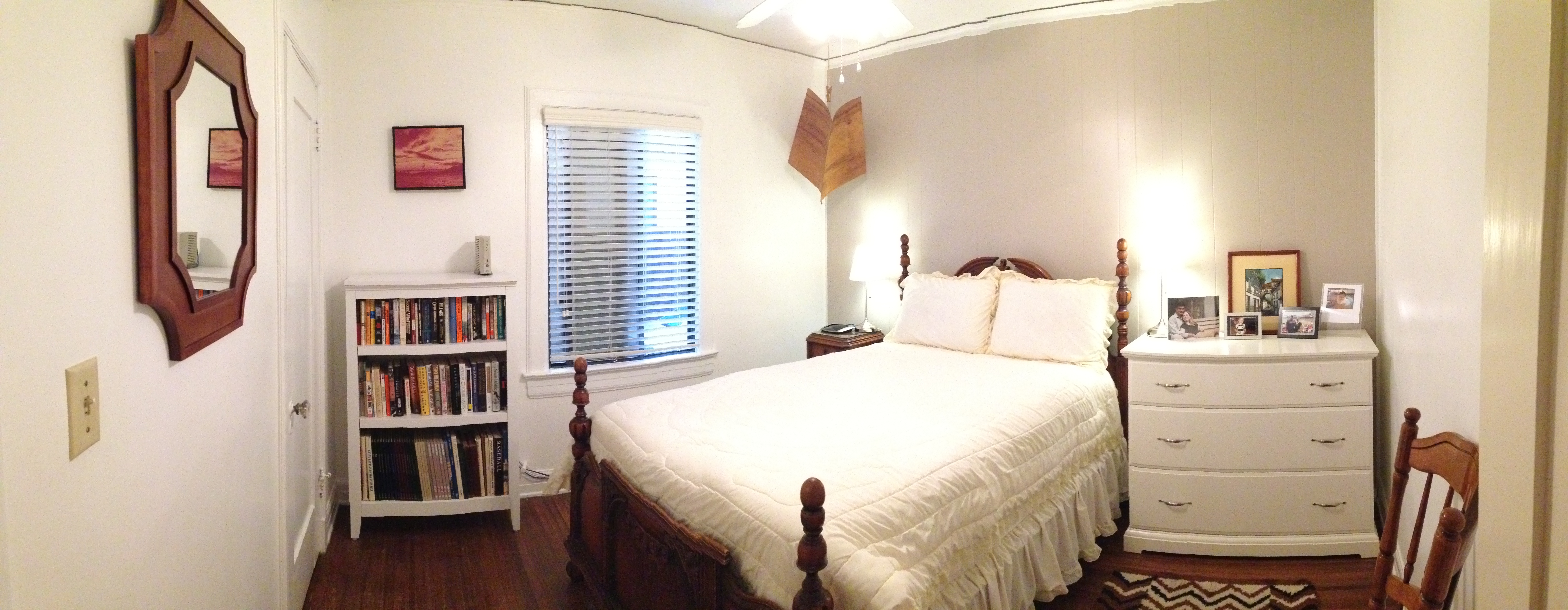
Moving down the hall to the guest room, we finally tackled hanging the great Target mirror we ordered.  Much to our surprise, it was much lighter than anticipated.  It was also NOT painted red – it was the perfect shade of wood to match the bed frame.  Go figure.  So that was quite the happy accident.  And in the spirit of using what you’ve got, we hung a great picture of Golden Gate Bridge that Jefe’s parents already had up on the wall above the bookshelf.

image_4

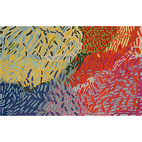
We still have a few more to things to go in this room including his mother’s rug and painting from Ecuador as well as a planned family photo gallery wall.

But here’s the **almost** finished product:

photo

More to come soon as we’ve got our momentum going to really get this project finished.  And yes, I’ve recently become obsessed with the iPhone’s panoramic option.  It really is a quick and dirty way to get wide-angle shots in VERY tight spaces – an overworked blogger’s dream.

Are any of you trying to wrap up any unfinished projects?  How did you find your motivation?

Advertisement

Q & A: Anne’s PreWar Starter

Hey Mal,

What I’d love your help with is some ideas for how I can break up the institutional whiteness of the walls and the monotony of the furniture to complete the look we have going.

As you can tell, I’m into contemporary design (fine, IKEA and CB2), but have been trying to mesh that with some classic/shabby chic elements – probably just the piano bench, really, but I’m mentally trying! It’s a pre-war apartment (1926) with hard wood floors and some pretty nice molding features, so incorporating some vintage or classical elements would probably bring the room together.

Specifically, the boyfriend and I have talked about getting some bold, cool pieces for the top of the wall unit, painting an accent wall, a new lighting fixture, throw pillows, maybe some additional window treatments. . .just as some starting points. We’ve thought about a rug for the area by the couch, but I think I’d rather not do one.

Look to the painting, which is by an artist from Austin, Texas, the Pittsburgh and Cincinnati bridge photos, and the piano bench, which is from an artisan we met locally (The Divine Chair) for the color palette.

Let me know if you have questions or need anything else. Thanks so much!

Anne

iPhone Pics 061

iPhone Pics 062

iPhone Pics 012

iPhone Pics 060

iPhone Pics 013

iPhone Pics 063

(These are now hanging above her piano)

First off, I would suggest Anne starts in the living room area. She needs some more colors to brighten up the space. Although she’s hesitant, I would seriously consider an area rug. You can bring in color, pattern and texture through one single piece. And with gorgeous yet budget friendly options from places like World Market, Overstock.com, CB2 and One Kings Lane, she could easily find one that fits the space and her budget.  I would go with something like the Confetti Rug from CB2:

CB2 Confetti RugNow, let’s bust out the paint cans.  Anne mentions painting an accent wall, which could be great.  If that’s the direction she wants to go, I would suggest the small wall by the dining area so it doesn’t compete and helps delineate that area as separate from the rest of the living space.  I would also suggest moving the painting to that wall – the white canvas against a colored backdrop will really make the art pop.  Here’s an example of different, primarily white pieces of art against darker walls:

b4d1c59a0f95cbb3_8370-w406-h406-b0-p0--modern-home-office

(Courtesy of Houzz)

Alternatively, you could paint the ceiling beams to really highlight the architecture.  You could even include the little lip of the wall that juts out and meets the ceiling.  Below’s a prime example of how you can give white walls a lot of visual interest with just a little bit of dark paint on ceiling beams:

Spanish-Revival-House-12-1-Kind-Design

(Courtesy of Onekindesign – I’m totally obsessed with the rest of this house tour too!)

Now let’s talk about the windows.  Although Anne gets some great light from the windows at the end of the room, it’s still not a huge amount.  So the first thing I’d keep in mind when hunting for new curtains is to avoid blocking light in any way.  Next suggestion is to rehang the curtain rod high & wide – it’s a common used technique by most designers to make both your ceilings seem taller and your windows seem wider.  This way, the curtain hangs in front of wall when they’re pulled the whole way open and not blocking ANY of the window.  As for a fabric, I probably wouldn’t go white.  I’d pick something with color that corresponds with that rug I’ve convinced Anne to buy like West Elm’s Linen Cotton Grommet Drapes in Desert Marigold to really brighten it up and add texture:

West Elm Marigold Linen Curtains

Anne also mentioned a new light fixture.  The easiest DIY in a rental for one of those infamous boob lights is to hide it with a shade.  Jefe and I did this in our last place (so unfortunately it was pre-blog = no photo), but I based it off of John and Sherry’s tutorial over on Young House Love.  I’d go with a shade that has some color so it does not blend in to the ceiling but I would avoid a pattern as it would directly compete with the piano bench below.  I think a fabric drum shade with a great texture is the right way to go, such as this one from Lamps Plus:

Drum Shade - Grey Burlap

Now let’s talk accessories.  First thing I would do is to add a plant on the window sill.  The green leaves will add another element of color and I always like to have a plant or two in a space to give it some true life.  And as orchids hold a special place in Anne and my’s heart (thank you college sorority), I thought a nice white one with a graphite base could be just the thing that window sill needs:

Potted Orchid

To finish up, I would add some color that coordinates with the rug and curtains through the accessories. I’d suggest some simple pillows from Crate & Barrel

hayward-green-18-pillow tilly-24x16-pillow

…and add some baskets to the lower shelves of the Expedit tv unit.  Then on the upper shelves, I would mix a combination of picture frames , small vases, decorative bowls, books, and other accessories.  A great example of a perfectly styled Ikea Expedit (although without a tv) is below:

1_Ikea-Expedit-Bookcase-Styling

( Courtesy of Meredith & Gwenyth, The New Yorkie)

Lastly,  she already has a great start on the walls with that painting and the gallery wall above the piano.  My one suggestion here is to actually rehang  the gallery wall so the space between the frames is just a bit tighter.  It really helps to make it cohesive.  Below are some great examples, all with black but very different frames:

Dumican Mosey Architects Gallery Wall

(Dumican Mosey Architects)

Lettered+Cottage+Guest+Bedroom+Photo+Wall

(The Lettered Cottage)

So Anne, there you have it.  Your room revamp courtesy of the Sledge.  Please keep us posted on your progress and share an after photo!

Slide1