So where the hell have I been? I know, I know – life just got away from me. I’ve been refocusing on myself a bit – trying to get healthier, taking care of some actual health stuff too. Then a crazy girls weekend with my bests from college followed by getting sick for a full week just as I was cutting out caffeine and anything that tasted delicious….
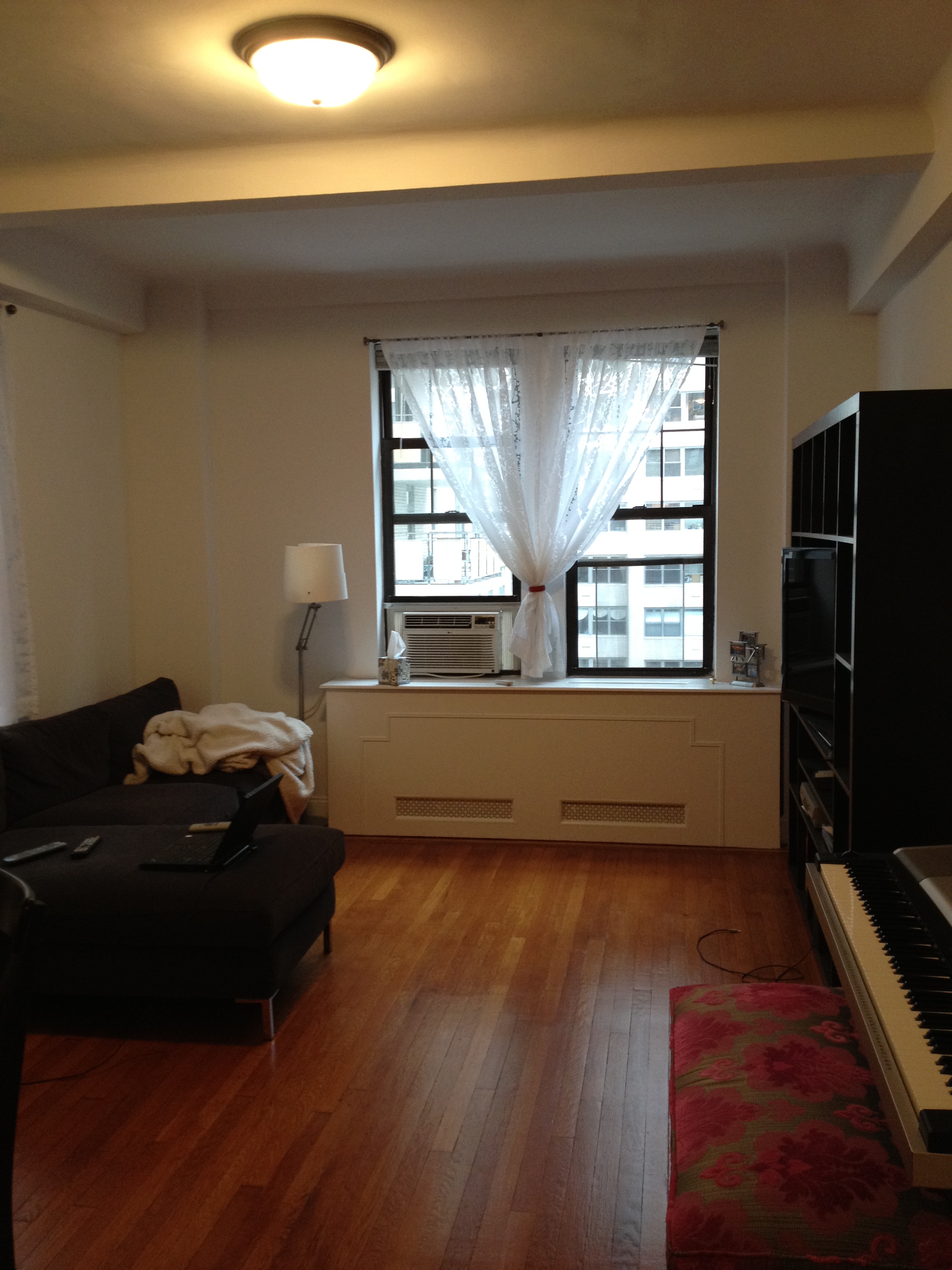
Today’s gonna be a quick recap of updates around Chez Sledge. Last when I left you, we were working on our office. Since then we got our new chair from Wayfair:

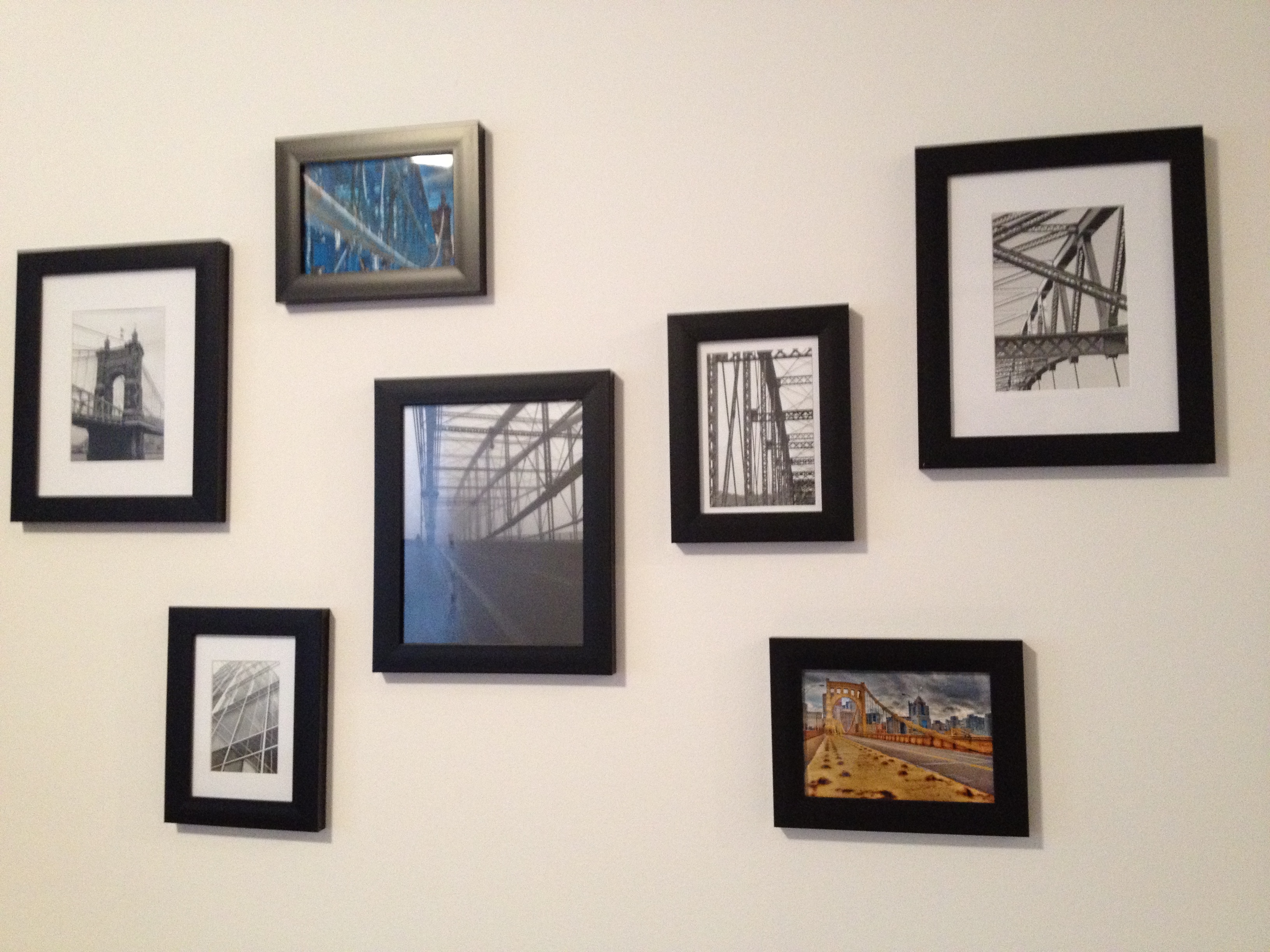
And last weekend Jefe hung up some more art. Can you believe he took those photos of Fenway himself? The one of the stadium’s green seats with the single red seat is stunning.


The room is really coming together; I can’t wait until we can afford that armchair so I finally have my reading nook! I’m planning to relocate that white chair to the dining room, scoot the shelf unit over and make room in the corner on the left for it, right by the floor lamp and next to the window.

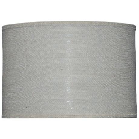
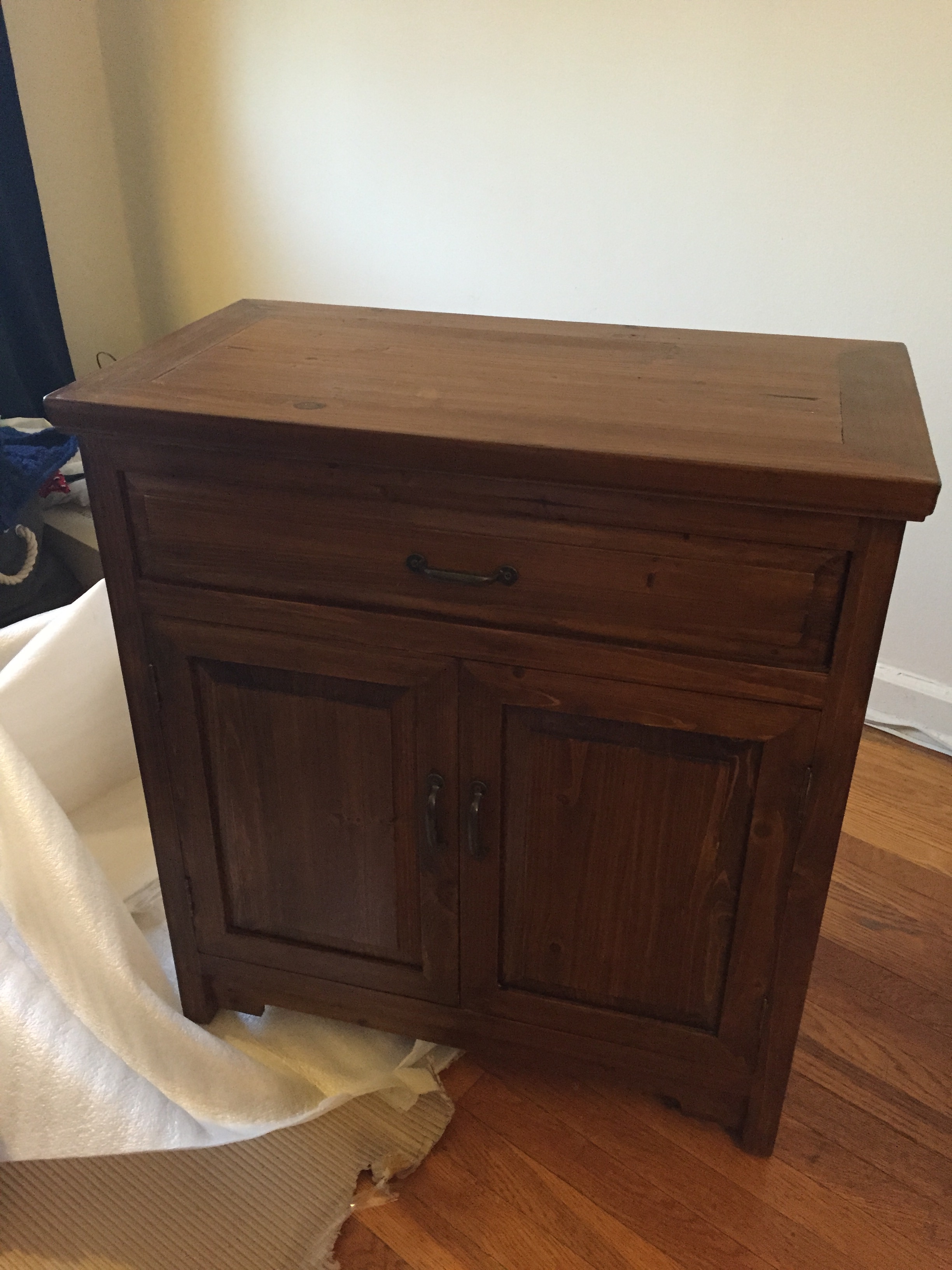
Next up is a quick update in the master bedroom. We finally managed to find a new nightstand for Jefe; it was made of solid wood with a reclaimed style to it. It was the first time we ordered anything from Joss & Main and I was thrilled with the outcome. Everything came pre-assembled and well packaged. From date of order until delivery was less than 2 weeks!

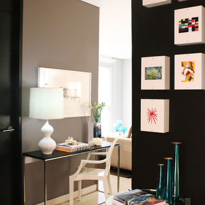
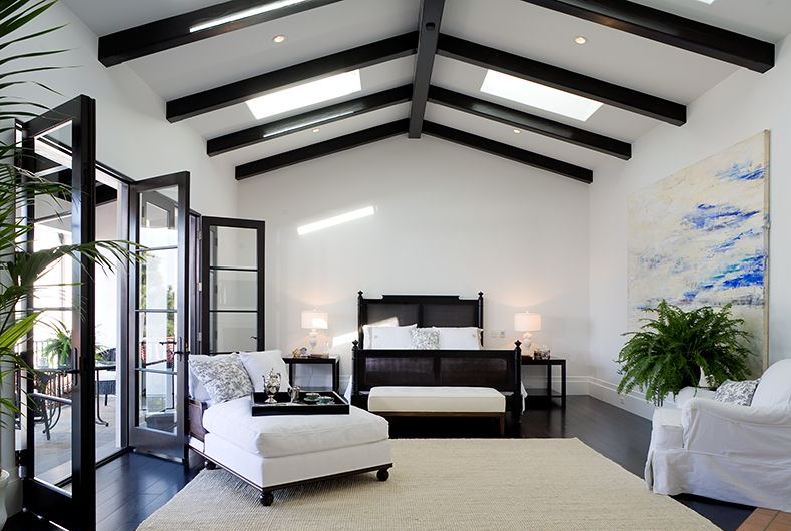
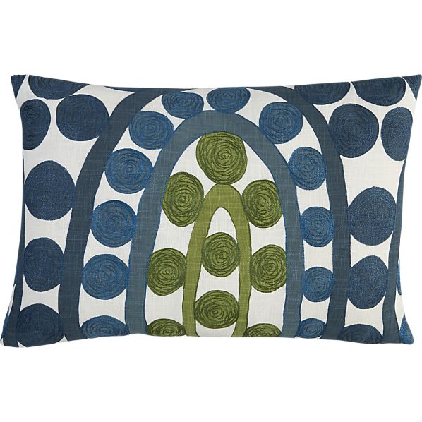
We’ve slowly been switching out the furniture in this room and with the addition of the new nightstand, it admittedly looks a little more mismatched than eclectic at the moment. That’s always the challenge once you move out of matching furniture sets to create a more curated look; it can look like quite the hodge podge of random items until you get close to the finish line. Here’s a little refresher (with a few updates) of what I’d eventually love the room to look like:

If you’re following along on Instagram, you’ll notice that we’ve made some serious progress in our backyard. But there’s a few more pieces to come so I’ll just leave you with this little before & after until I can give you the full recap.
BEFORE
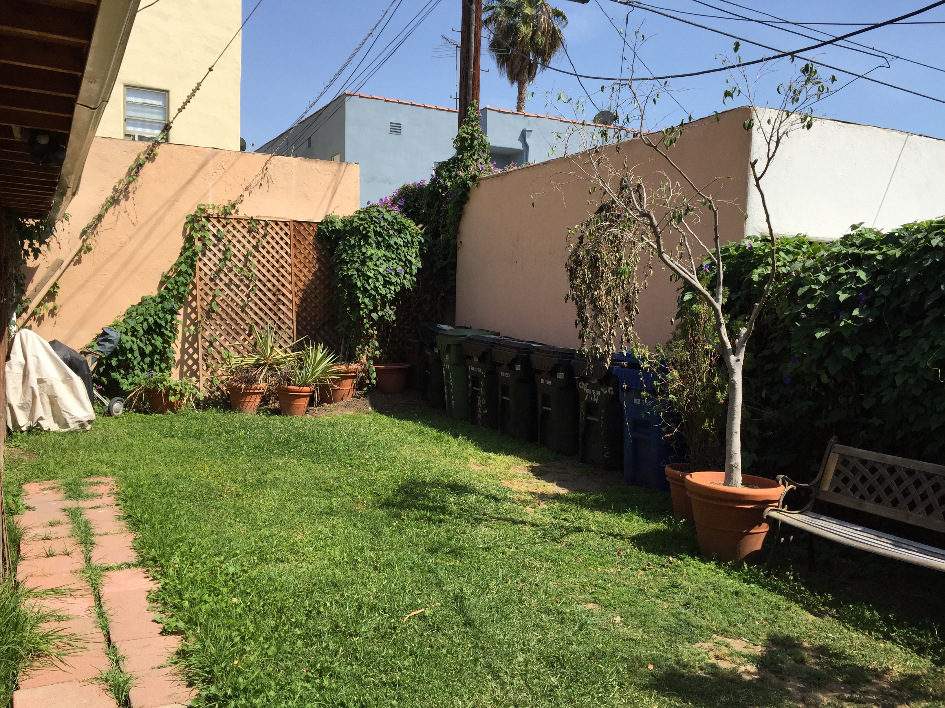
AFTER
Lastly, I finally got around to tackling the lighting situation in our kitchen. After a quick trip to HomeGoods during my girls’ weekend, I snagged a cheap, neutral drum shade to cover up that horrendous fake-brass boob light.
BEFORE

AFTER

I still need to add a piece of fabric to it so you can’t see the ugly fixture it’s hiding underneath, but just by hanging the shade I can feel such a difference in the room.

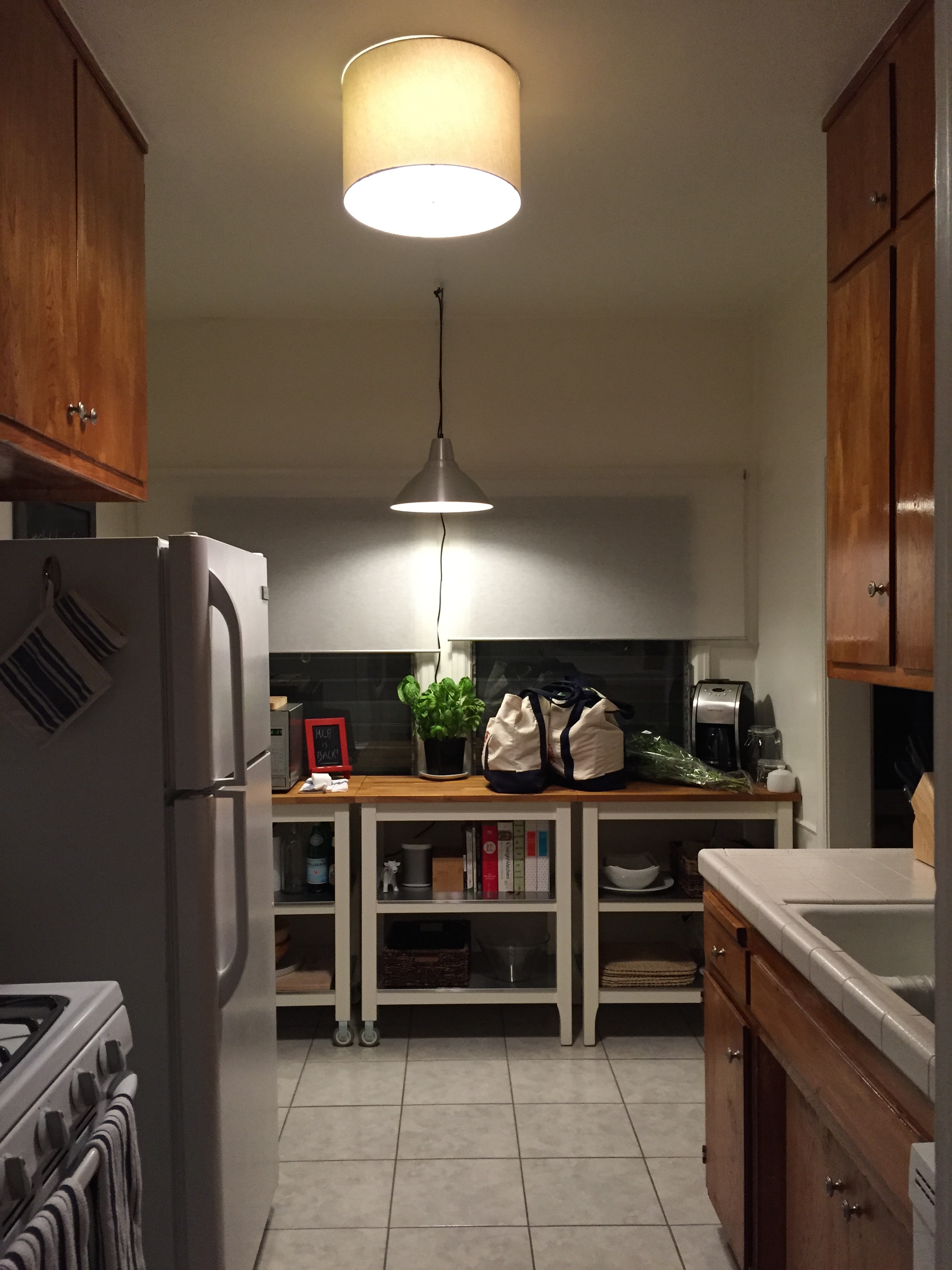
Jefe and I also made a quick trip to Ikea last Saturday and managed to snag the Foto plug-in pendant and I can FINALLY see what I’m cutting while making dinner! I need to use some white cord cover so it blends in a little more, but I’m really happy with it.

I tried hanging it with the ceiling screws included, but it turns out our ancient drywall is a bit crumbly in the ceiling so 3M hooks to the rescue. I only wish I had tried them before I put giant holes in my ceiling but that’s what spackle is for, am I right?!
Here’s both lights in action:
All in all, we’ve been making some great progress around the place. I’m really please with how it’s turning out!