Jefe left on another business trip yesterday. I came home to find this on our new chalkboard:
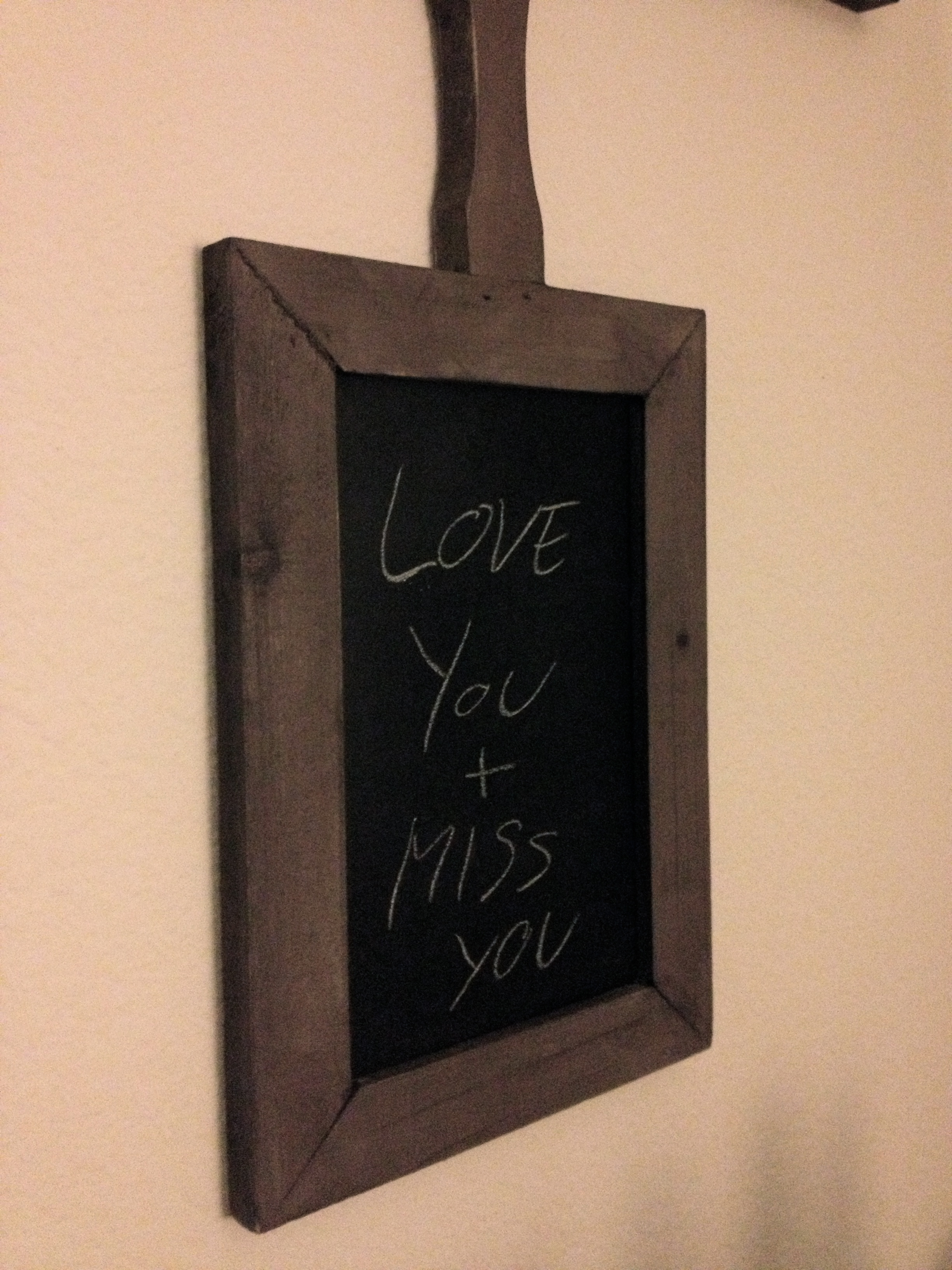
Apparently I’m not the only one that likes having it around. Sometimes it’s just the little things…. ❤

Jefe left on another business trip yesterday. I came home to find this on our new chalkboard:
Apparently I’m not the only one that likes having it around. Sometimes it’s just the little things…. ❤
So what do you do when THIS is in your way?!

That’s what Jefe and I have been asking ourselves since we started the reno at his parents’s place. Ignore it? Try to integrate it? “Accidentally” drop it so it smashes in to 100 pieces?
The answer is not nearly as easy as you think. The above structure is actually a lamp. It’s a lamp that Jefe’s dad Harry has had since he was a bachelor in the swinging 60’s. And he is not willing to part with it. As you may remember, it used to hang in the office pre-renovation:
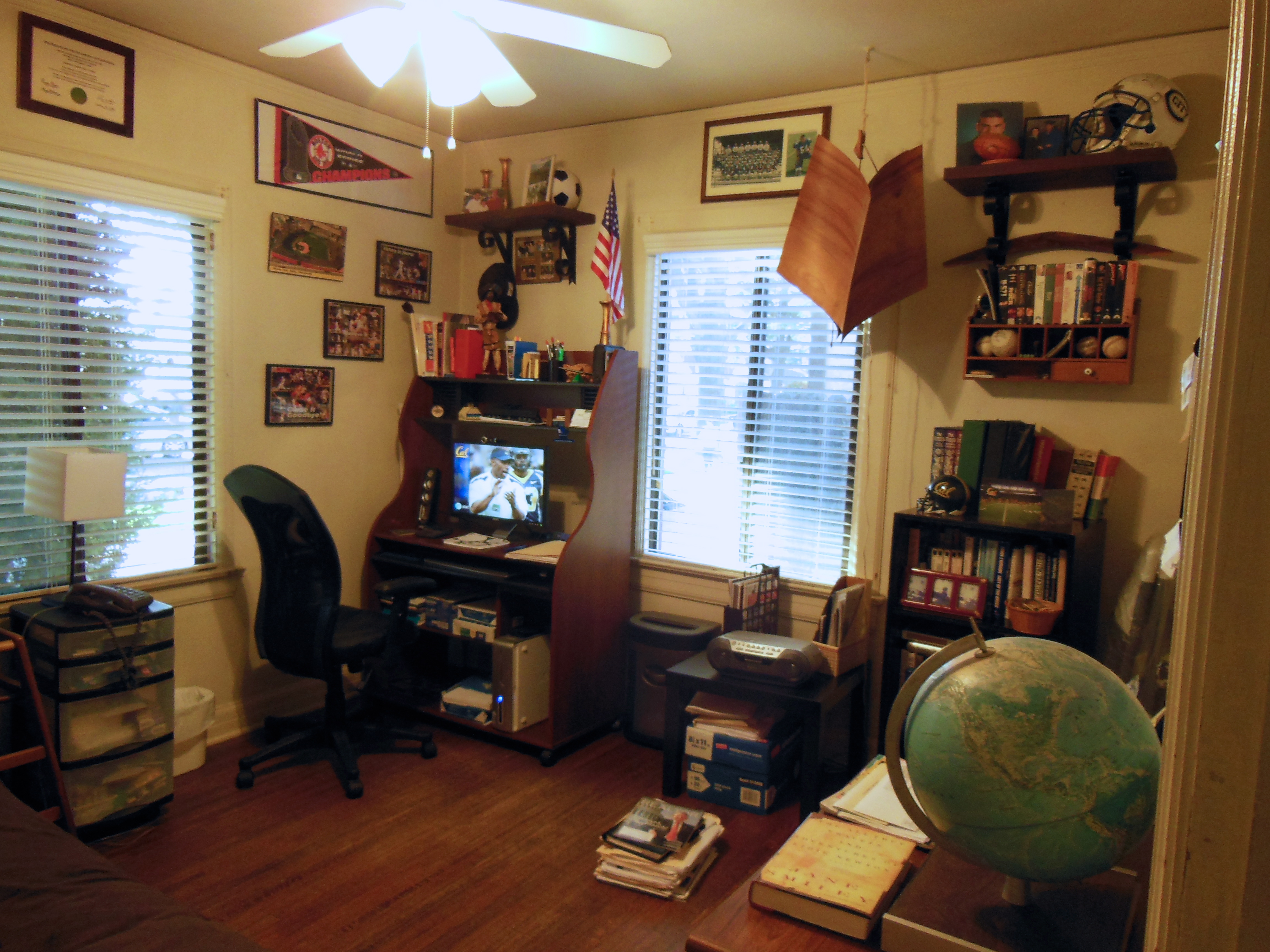
When we started to reassemble the office the other weekend once all the furniture was bought and put together, Gloria, Jefe’s mom, insisted that the lamp go. It did not fit with the old-school study feel that we were aiming for. Here’s some in progress photos:

Gloria just wanted it GONE. But Harry was adament about keeping the one remnant of his bachelorhood. So stay it must. But where on earth should we put it?!
Needless to say the question was answered for us when we arrived to assemble the remaining furniture and found it hanging in the guest bedroom.

So I did my best to minimize the eyesore by tying up the extra cord and hiding it inside (since they will never actually plug it in). And lucky for us, it’s in the far corner which you don’t immediately see when you walk in the room. It still smacks you in the face when you actually round the corner of the doorway, but sometimes you just have to cater to the client’s wants….. So you’ve got to roll with the punches, and as my favorite Tim Gunn says “Make it work!”
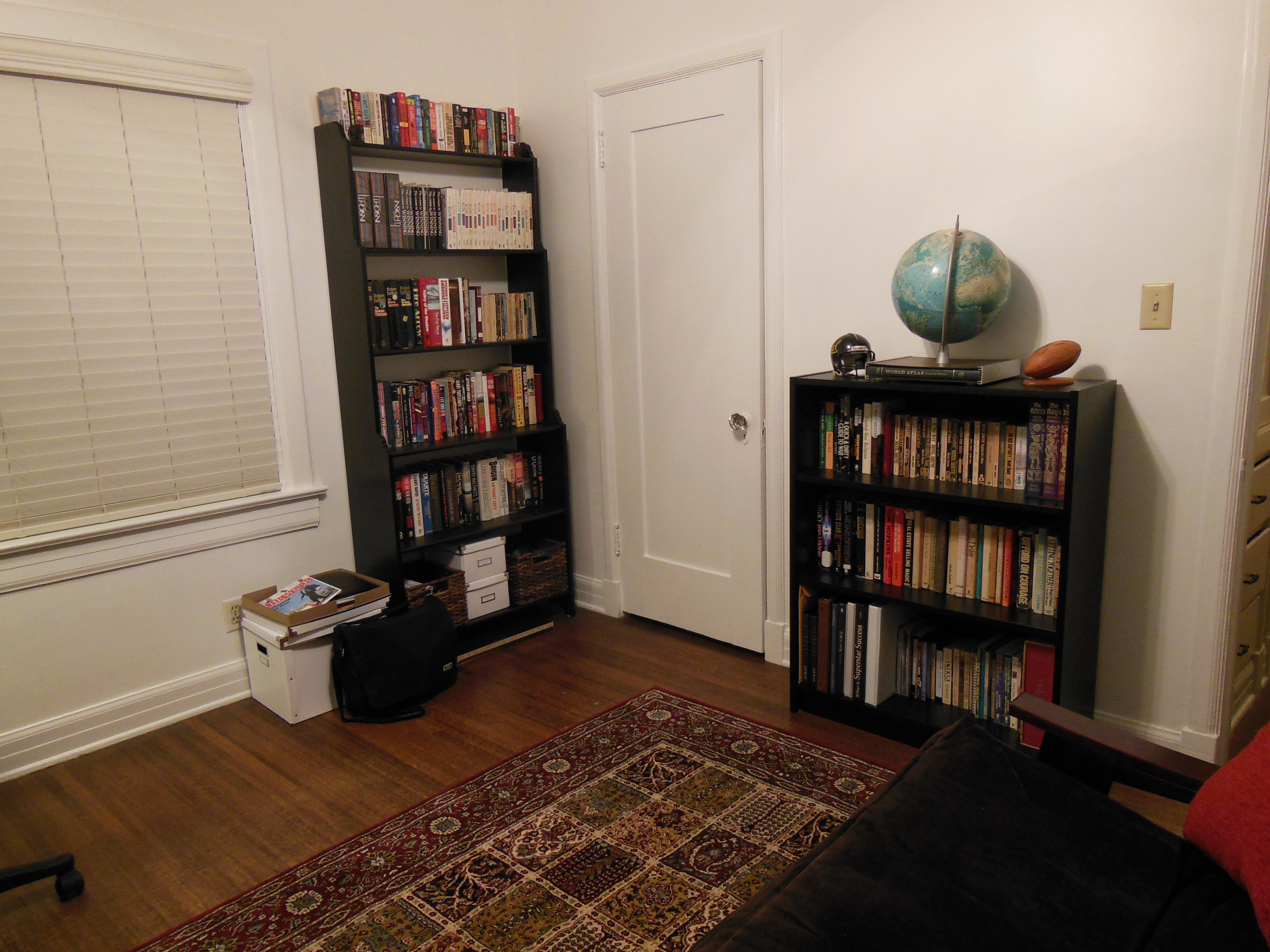
So Jefe and I let it stay (secretly in hopes that it may magically disappear one day). Now for the rest of the room, I think it’s looking a MILLION times better than when we started. Honestly, Jefe and I were discussing that it really looks like a completely different room just with some paint on the walls and two new pieces of furniture. Here’s a little in-progress photo of the guest room in it’s current state:


I can’t WAIT to get this room finished. It’s going to look awesome (here’s a little reminder in case you need a refresher.) And Gloria can’t wait to have guests over to show it off, which I guess is a sign of a job well done and a satisfied home owner 😀
Let me start out with stating the obvious: I have the world’s best mom. She’s amazing, thoughtful, and still spoils me with care packages filled with Pennsylvania goodies like apple butter and homemade chocolates. She misses driving her mini-van and still carries snacks and baby wipes everywhere even though all of the kids have been out of the house for quite some time. She’s just one awesome lady who will forever affectionately be known to all of my friends as Momma Sny despite a name change years ago. So Mom, this post goes out to you. It’s been too long since I got to share this day with you and hope that won’t last forever.

But Momma Sny isn’t the only awesome mother in our lives. Gloria, my Jefe’s mom, is pretty stellar too. So we decided to treat her and Jefe’s dad, Harry, to a little brunch at our place.
I was hoping to really pull out all the stops on the table setting to show you all some new ideas for setting your own, however, in the vein of keeping it real with you all, life got in the way. Specifically, Django, some ice cream, and a date on the couch with my Jefe on Saturday night.
But I did at least set the table and threw out a vase of my favorites: hydrangeas.

For the observant bunch, you’ll also notice we hung some new (well, new in that it’s finally out of the moving box) art, and my little chalk board from Rejuvenation.
Jefe and I also made a happy discovery: in extending our table to make more space for brunch, we had to place the table parallel to our dresser and island. Low and behold, the bigger table actually makes the room feel bigger! Maybe it had to do with the chairs previously being on an angle (out of necessity to access our bedroom and dresser drawers). Or maybe the matching parallel lines just gives it a cleaner, less cluttered feel despite the use of MORE floor space. Whatever it is, Jefe and I have decided to keep the set up for the time being. A bonus – with the table extended, we can actually push all of the chairs in! More space for us. #winning
In other news, we purged our puppy fund yesterday. And no, we do not have a little fur ball of joy headed our way. Our mattress, which I payed a pretty penny for only 5 years ago, is officially a piece of crap. It’s amazing how down hill it’s gone just in the last few weeks. It’s gotten to the point that Jefe looks forward to his business trips just so he can sleep on a bed without the Grand Canyon running through the middle. So alas, our puppy fund went towards making our backs much happier and putting a kabosh on a dog for the time being. Insert sad face.
But don’t think for one minute that I’ve stopped looking at pictures of cockapoos and dog beds ;-).

Hey Mal,
What I’d love your help with is some ideas for how I can break up the institutional whiteness of the walls and the monotony of the furniture to complete the look we have going.
As you can tell, I’m into contemporary design (fine, IKEA and CB2), but have been trying to mesh that with some classic/shabby chic elements – probably just the piano bench, really, but I’m mentally trying! It’s a pre-war apartment (1926) with hard wood floors and some pretty nice molding features, so incorporating some vintage or classical elements would probably bring the room together.
Specifically, the boyfriend and I have talked about getting some bold, cool pieces for the top of the wall unit, painting an accent wall, a new lighting fixture, throw pillows, maybe some additional window treatments. . .just as some starting points. We’ve thought about a rug for the area by the couch, but I think I’d rather not do one.
Look to the painting, which is by an artist from Austin, Texas, the Pittsburgh and Cincinnati bridge photos, and the piano bench, which is from an artisan we met locally (The Divine Chair) for the color palette.
Let me know if you have questions or need anything else. Thanks so much!
Anne


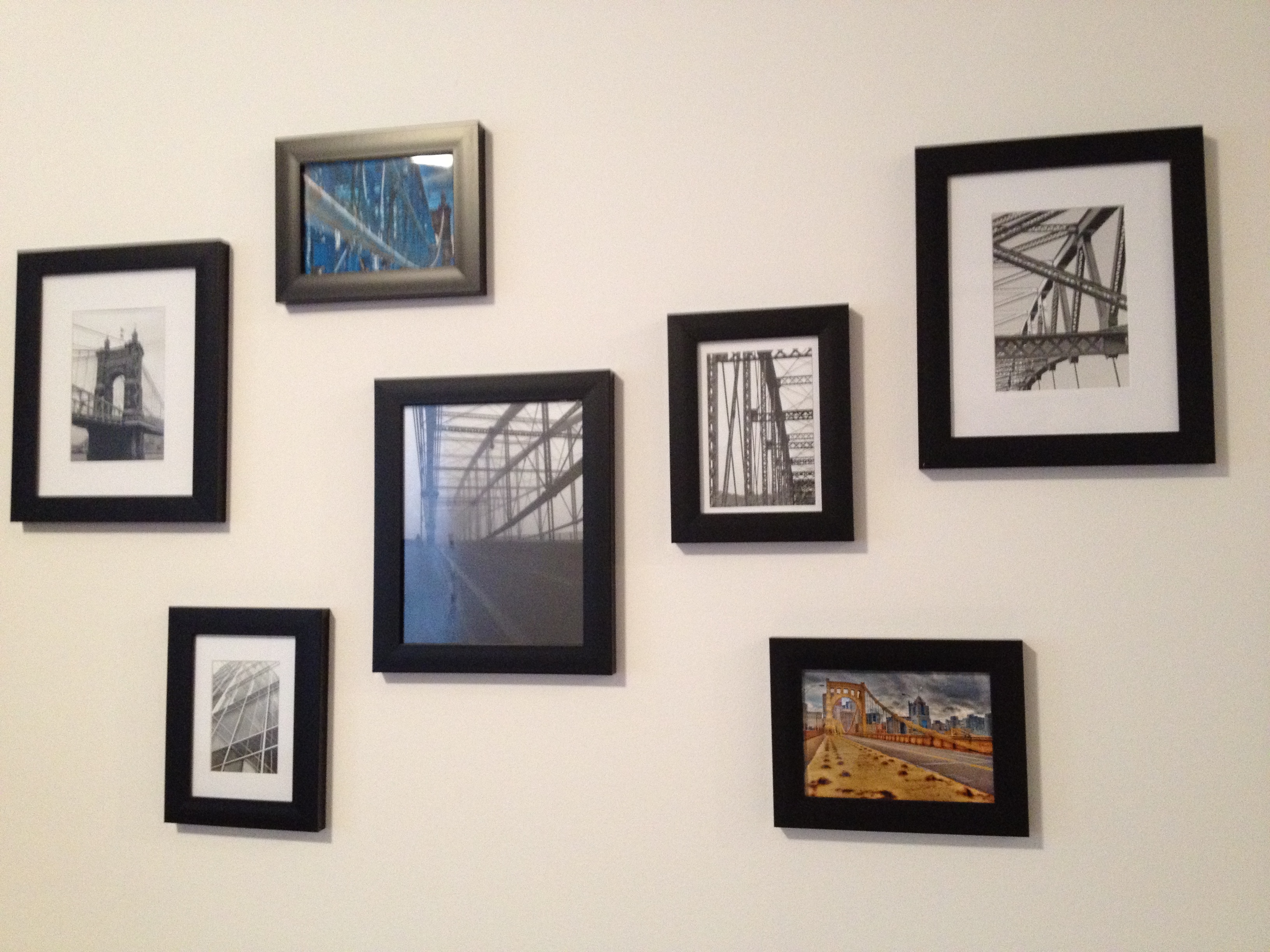
(These are now hanging above her piano)
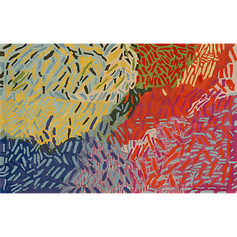
First off, I would suggest Anne starts in the living room area. She needs some more colors to brighten up the space. Although she’s hesitant, I would seriously consider an area rug. You can bring in color, pattern and texture through one single piece. And with gorgeous yet budget friendly options from places like World Market, Overstock.com, CB2 and One Kings Lane, she could easily find one that fits the space and her budget. I would go with something like the Confetti Rug from CB2:
 Now, let’s bust out the paint cans. Anne mentions painting an accent wall, which could be great. If that’s the direction she wants to go, I would suggest the small wall by the dining area so it doesn’t compete and helps delineate that area as separate from the rest of the living space. I would also suggest moving the painting to that wall – the white canvas against a colored backdrop will really make the art pop. Here’s an example of different, primarily white pieces of art against darker walls:
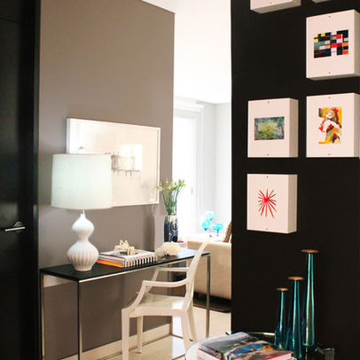
(Courtesy of Houzz)
Alternatively, you could paint the ceiling beams to really highlight the architecture. You could even include the little lip of the wall that juts out and meets the ceiling. Below’s a prime example of how you can give white walls a lot of visual interest with just a little bit of dark paint on ceiling beams:
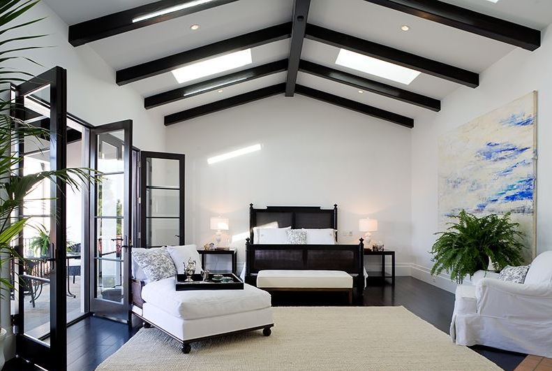
(Courtesy of Onekindesign – I’m totally obsessed with the rest of this house tour too!)
Now let’s talk about the windows. Although Anne gets some great light from the windows at the end of the room, it’s still not a huge amount. So the first thing I’d keep in mind when hunting for new curtains is to avoid blocking light in any way. Next suggestion is to rehang the curtain rod high & wide – it’s a common used technique by most designers to make both your ceilings seem taller and your windows seem wider. This way, the curtain hangs in front of wall when they’re pulled the whole way open and not blocking ANY of the window. As for a fabric, I probably wouldn’t go white. I’d pick something with color that corresponds with that rug I’ve convinced Anne to buy like West Elm’s Linen Cotton Grommet Drapes in Desert Marigold to really brighten it up and add texture:

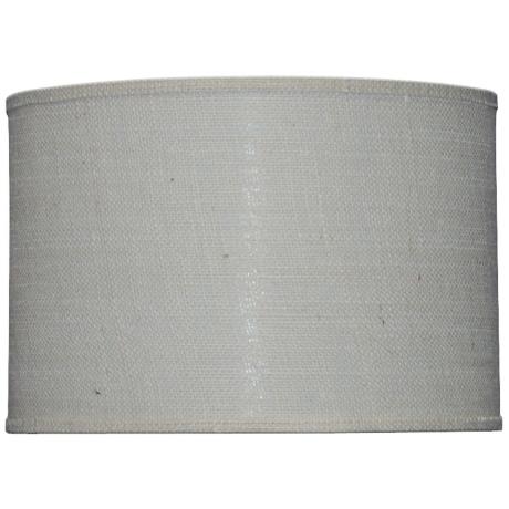
Anne also mentioned a new light fixture. The easiest DIY in a rental for one of those infamous boob lights is to hide it with a shade. Jefe and I did this in our last place (so unfortunately it was pre-blog = no photo), but I based it off of John and Sherry’s tutorial over on Young House Love. I’d go with a shade that has some color so it does not blend in to the ceiling but I would avoid a pattern as it would directly compete with the piano bench below. I think a fabric drum shade with a great texture is the right way to go, such as this one from Lamps Plus:
Now let’s talk accessories. First thing I would do is to add a plant on the window sill. The green leaves will add another element of color and I always like to have a plant or two in a space to give it some true life. And as orchids hold a special place in Anne and my’s heart (thank you college sorority), I thought a nice white one with a graphite base could be just the thing that window sill needs:

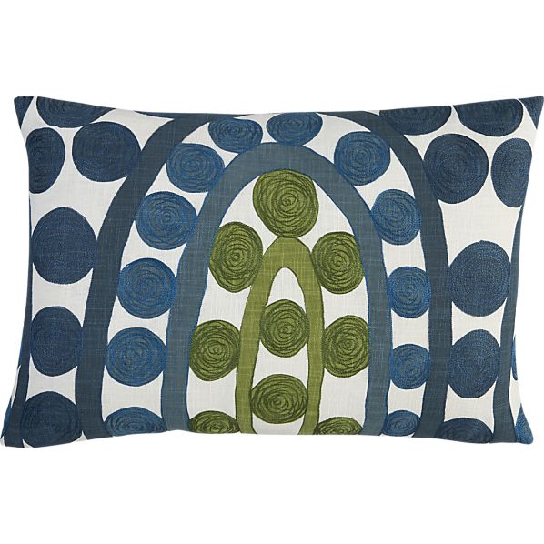
To finish up, I would add some color that coordinates with the rug and curtains through the accessories. I’d suggest some simple pillows from Crate & Barrel…

…and add some baskets to the lower shelves of the Expedit tv unit. Then on the upper shelves, I would mix a combination of picture frames , small vases, decorative bowls, books, and other accessories. A great example of a perfectly styled Ikea Expedit (although without a tv) is below:

( Courtesy of Meredith & Gwenyth, The New Yorkie)
Lastly, she already has a great start on the walls with that painting and the gallery wall above the piano. My one suggestion here is to actually rehang the gallery wall so the space between the frames is just a bit tighter. It really helps to make it cohesive. Below are some great examples, all with black but very different frames:


So Anne, there you have it. Your room revamp courtesy of the Sledge. Please keep us posted on your progress and share an after photo!

Today I bring you this month’s Lust List. As the temperatures have started to rise here in LA, I’ve started to get an itch for all things summer: sandals, sundresses, and TRAVEL. Though the travel part may honestly have as much to do with the temperatures as it does with me finally renewing my passport. Or it could just be the fact that, as of late, I’ve been booking a LOT of other people’s travel at work (Cannes to be exact). Nonetheless, I am dying to jet off to a beach somewhere, be it Hermosa in LA, the Jersey shore, or the crisp white beaches of the French Riviera. So this month’s list is a bit more focused on summer travel necessities with a few home goods thrown in for good measure.

1) JCrew Farmer’s Market Tote. So classic, simple, and useful. And it’s versatile enough to lay flat in your suitcase, ready to be pulled out for day trips to the beach or boardwalk.
2) Sam Edelman Gigi Sandals. Unlike comparable gladiator-type sandals, these have serious cushion. No flat footed sandals for me. I’ve bought a new pair every year, usually in a different color. Last year’s were silver, this year I’m feeling something a bit shinier….
3) Banana Republic Safari Shirtdress. I’m obsessed with shirt dresses. It may have something to do with Rachel McAdam’s wardrobe in Midnight in Paris… I just can’t get enough!

(Photo compilation courtesy of Good Girl Inc. which has a good breakdown of how to recreate this look)
4) Muttropolis Marine Print Lounge Dog Bed. My puppy fever is in full swing. We’re still figuring out the details of when a furry little thing will call our place home, but I can not WAIT for that day to come. So I might as well be fully prepared.
5) Fine Art America’s Gillette Razor 1904 Print. Jefe found this on a recent trip to The Art of Shaving. He came home and decided it was just what our master bathroom needed.
6) C.Wonder Golden Chevron Highball Glasses. I’ve been working on revamping our bar area. Nothing like a little old-school swank to add some glamour to an otherwise dull corner of our dining room.
7) Kate Spade Harrison Street Passport Holder. Are we noticing a gold theme lately?! You can’t be an international jet setter without a truly elegant passport holder.
And coming up next I’ve got that reader Q & A I teased about yesterday. Can’t wait to share with you guys!
